REVISION DATE: 14-Apr-2015 15:31:51
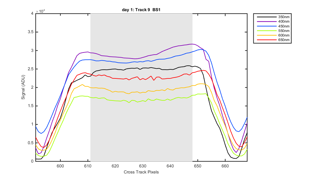
The graphs below show how I defined the tracks. Grey patches are what is averaged for each track. Note that a number of the tracks where saturated also some of the images the integration times where too short causing the tracks to lost their nice saddle shape and become pointy at one end. The Day 4 data should be better. See Mikes note below.
Email from Mike: We need to be careful with picking tracks from day#1 where exposure time was too short, leading to "pointed" (i.e. not-saddle-shaped) tracks had saturation, leading to "round-top" (i.e. not-saddle-shaped) tracks
Figure 1
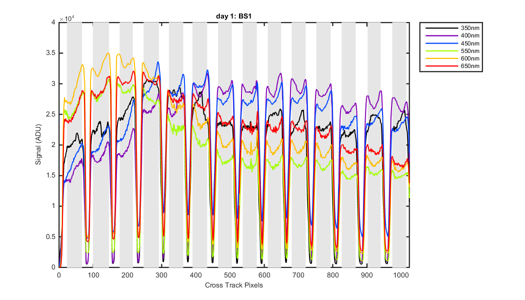
Figure 2

Figure 3
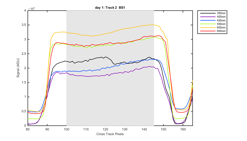
Figure 4
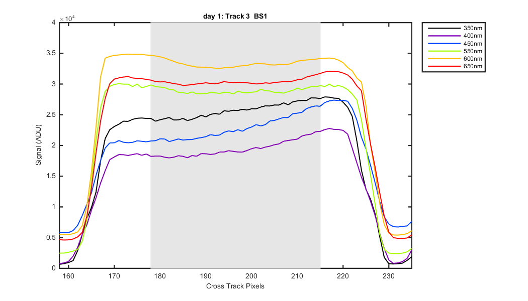
Figure 5
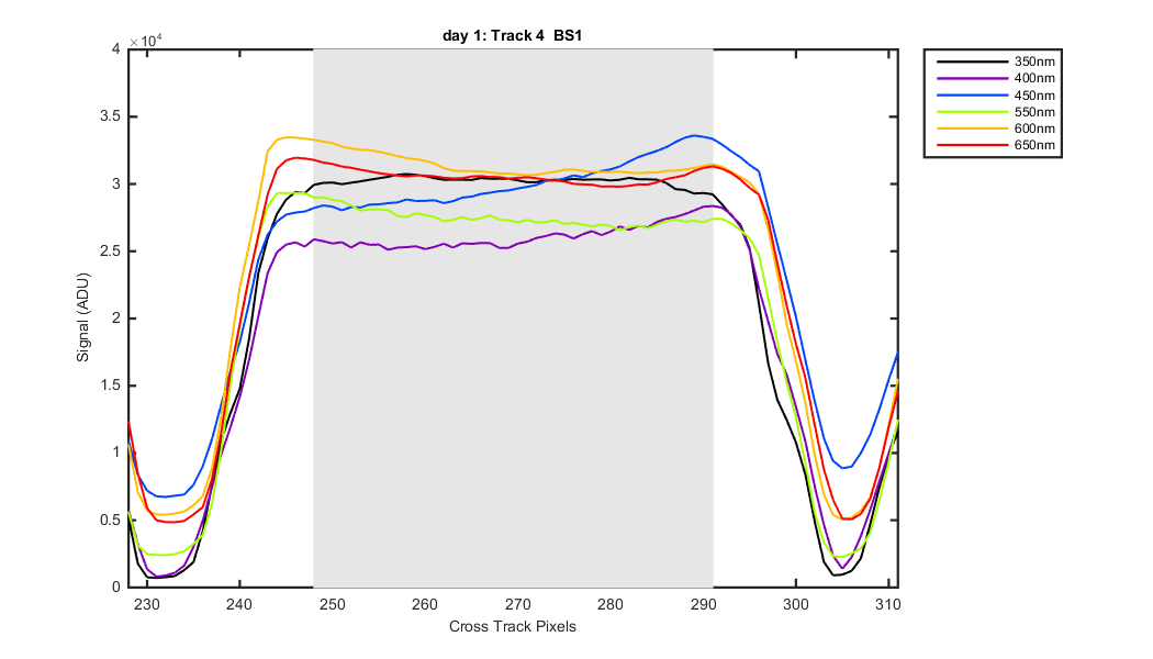
Figure 6

Figure 7

Figure 8

Figure 9
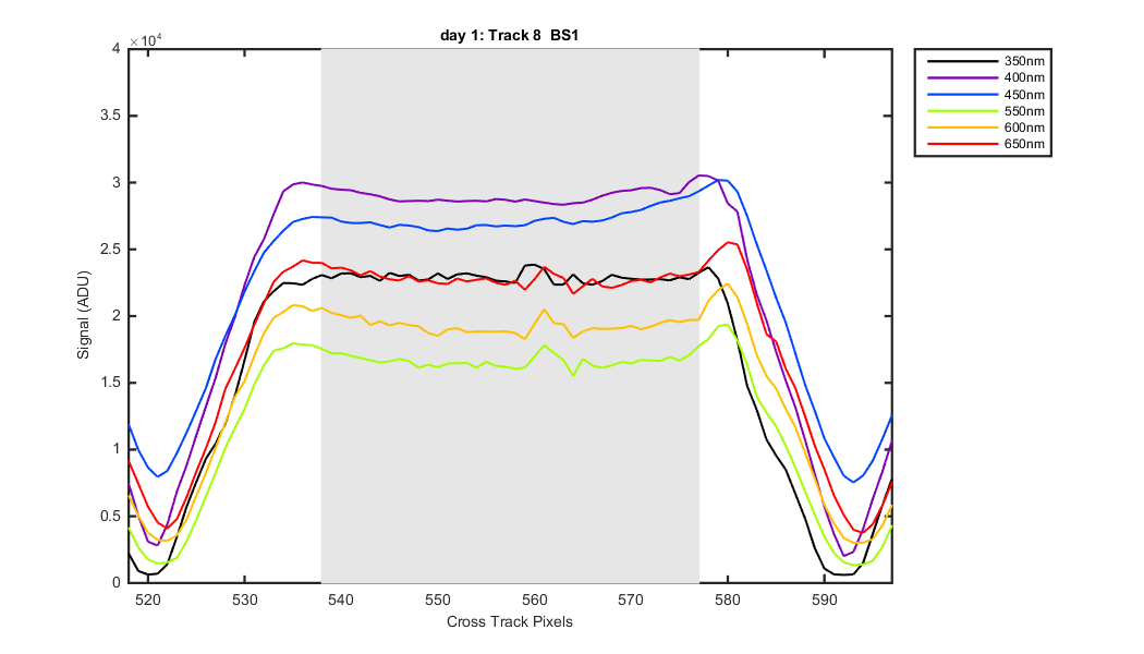
Figure 10

Figure 11
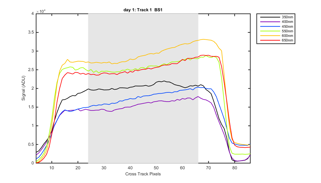
Figure 12
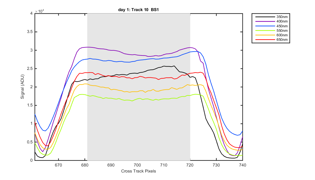
Figure 13
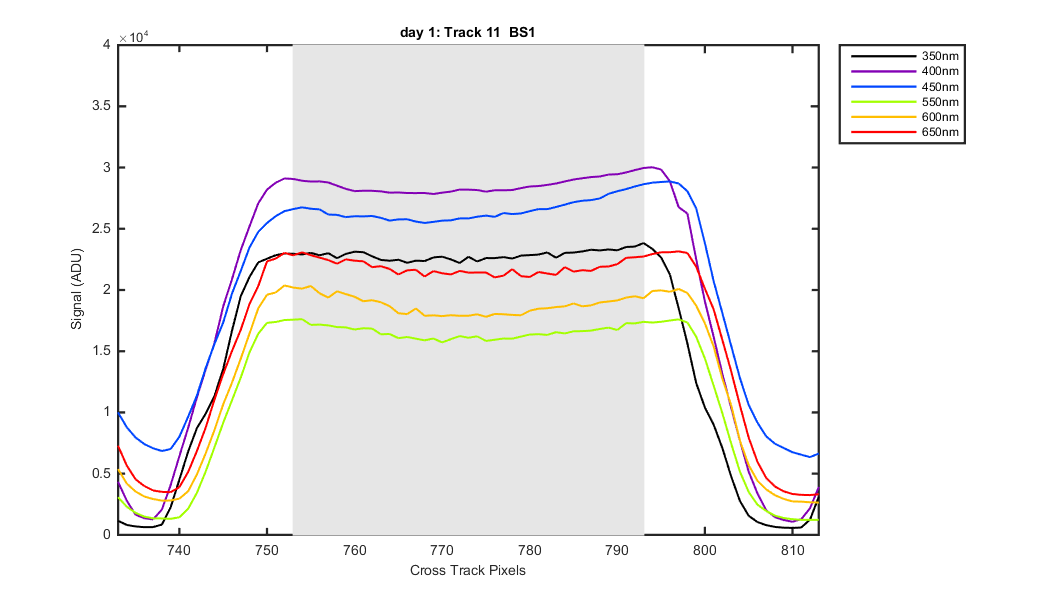
Figure 14
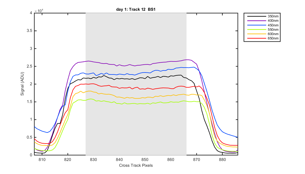
Figure 15
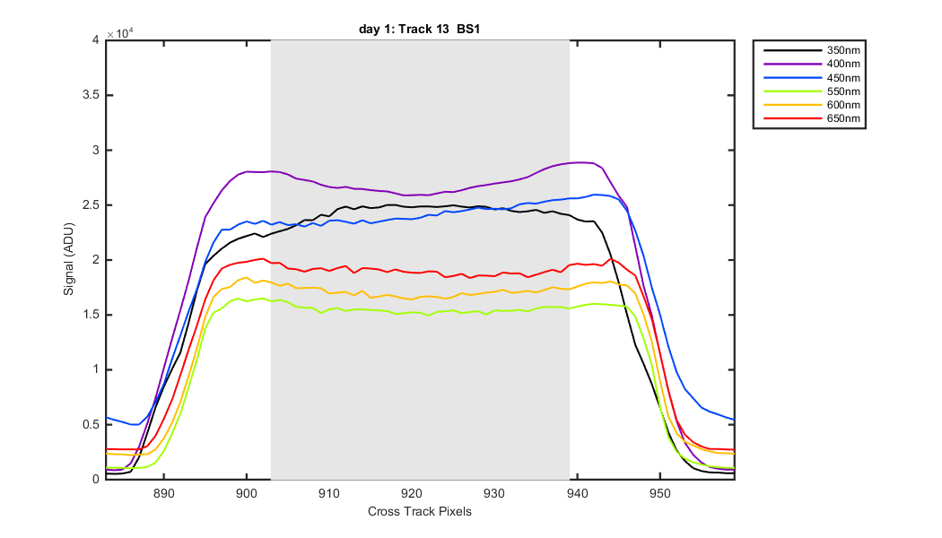
Figure 16
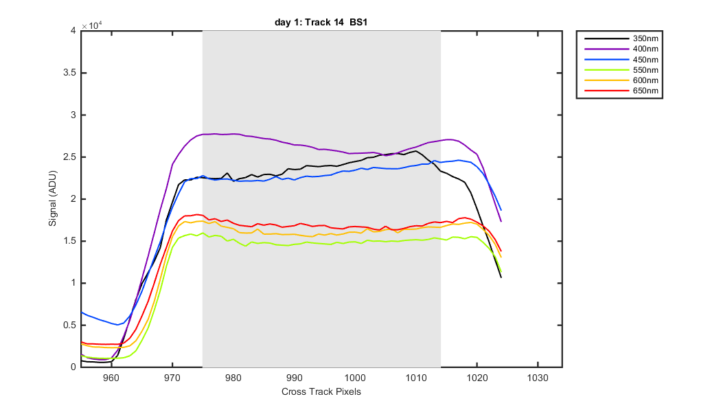
Figure 17

Figure 18

Figure 19

Figure 20
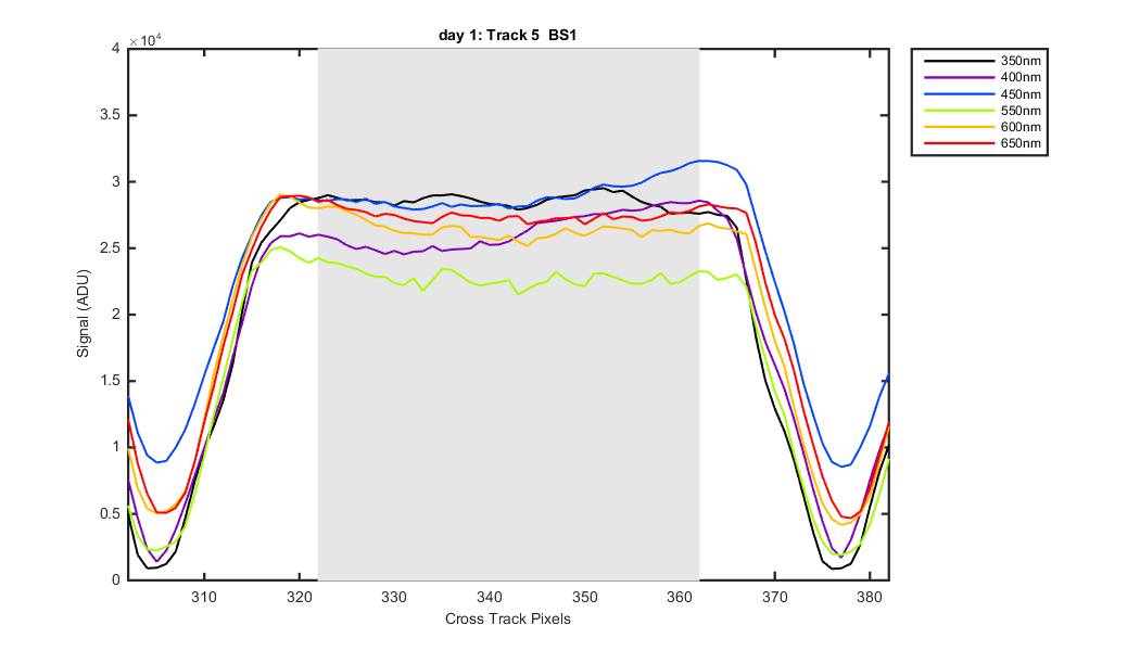
Figure 21
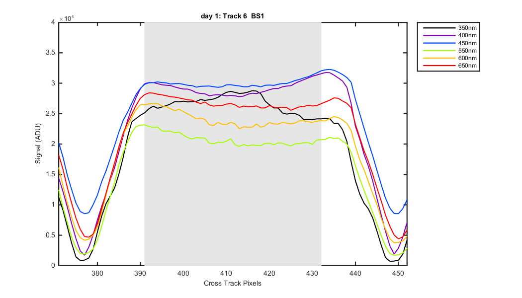
Figure 22
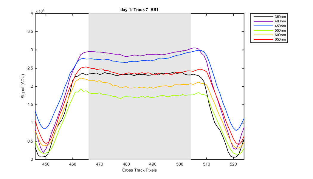
Figure 23

Figure 24