REVISION DATE: 29-Aug-2018 12:24:21
Laser data from MikeF in Hawaii via Ekspla. These are grouped by wavelength and track. These are the saturated and unsaturated data which will be knitted together to make one. laser data set for this wavelength.
Saturation is determined by looking shape of the laser peaks. As they diverege from the . unsaturated data it becomes obvious which are saturated. Norm Val is which ever parameter is being used to normalize the data. In some cases this is just a uncaled PDmon and in others it may be a calibrated monitor. Frac Norm Val has the Norm Val number but divided by the Norm Val with the lowest int time. Max pix is the pixel value of the peak. Fit Pix is the Gaussian fitted center of the laser peak. Blooming? tells if the laser data has bloomed into other pixels. I calculate this by calculating the std/mean of the 3 pixels aruond the peak. If this is less than 0.1 I mark it as blooming. The idea being the flatter the top of the peak the more blooming there is. This is not perfect, more data from other wavelength should help in finding the blooming more precisly.
| Descrption | int time (sec) | Wavelength(nm) | Saturated? | Norm Val | Frac Norm Val | Max pix | Fit Pix | Blooming? |
|---|---|---|---|---|---|---|---|---|
| Track 13 Net (ADU/pix/sec) - dsub | 2 | 410 | 0 | -0.8485 | 1 | 203 | 203.3643 | 0 |
| Track 13 Net (ADU/pix/sec) - dsub | 4 | 410 | 0 | -0.82737 | 0.97509 | 203 | 203.3728 | 0 |
| Track 13 Net (ADU/pix/sec) - dsub | 6 | 410 | 0 | -0.8222 | 0.96901 | 203 | 203.3779 | 0 |
| Track 13 Net (ADU/pix/sec) - dsub | 8 | 410 | 1 | -0.86125 | 1.015 | 203 | 203.4018 | 0 |
| Track 13 Net (ADU/pix/sec) - dsub | 10 | 410 | 1 | -0.82424 | 0.97141 | 203 | 203.4273 | 0 |
| Track 13 Net (ADU/pix/sec) - dsub | 15 | 410 | 1 | -0.84039 | 0.99044 | 203 | 203.4136 | 0 |
| Track 13 Net (ADU/pix/sec) - dsub | 20 | 410 | 1 | -0.81458 | 0.96003 | 203 | 203.3893 | 0 |
| Track 13 Net (ADU/pix/sec) - dsub | 40 | 410 | 1 | -0.82744 | 0.97518 | 203 | 203.5363 | 1 |
| Track 13 Net (ADU/pix/sec) - dsub | 80 | 410 | 1 | -0.80921 | 0.95369 | 203 | 203.5376 | 1 |
The first graph shows all the data with int times and sat/unsat info. The second graphs whos the same data but just near the peak. The third graph shows the same data as 2 but with circles rather than lines on the left yaxis and the difference between the data from the shorted and longest int times on the right yaxis. The 4th figure has 2 panels. The left panel shows the diffence for all the data relative to the shorted int time. The right panel is the values from the left panel at the laser peak verses int time. This is an approximately "amount" of saturation. The 5th graph show the mean/std and max diff again. Just to see what they look like.
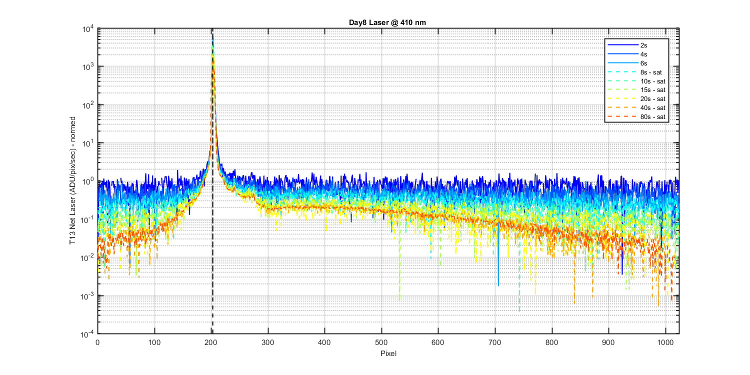
Figure 1
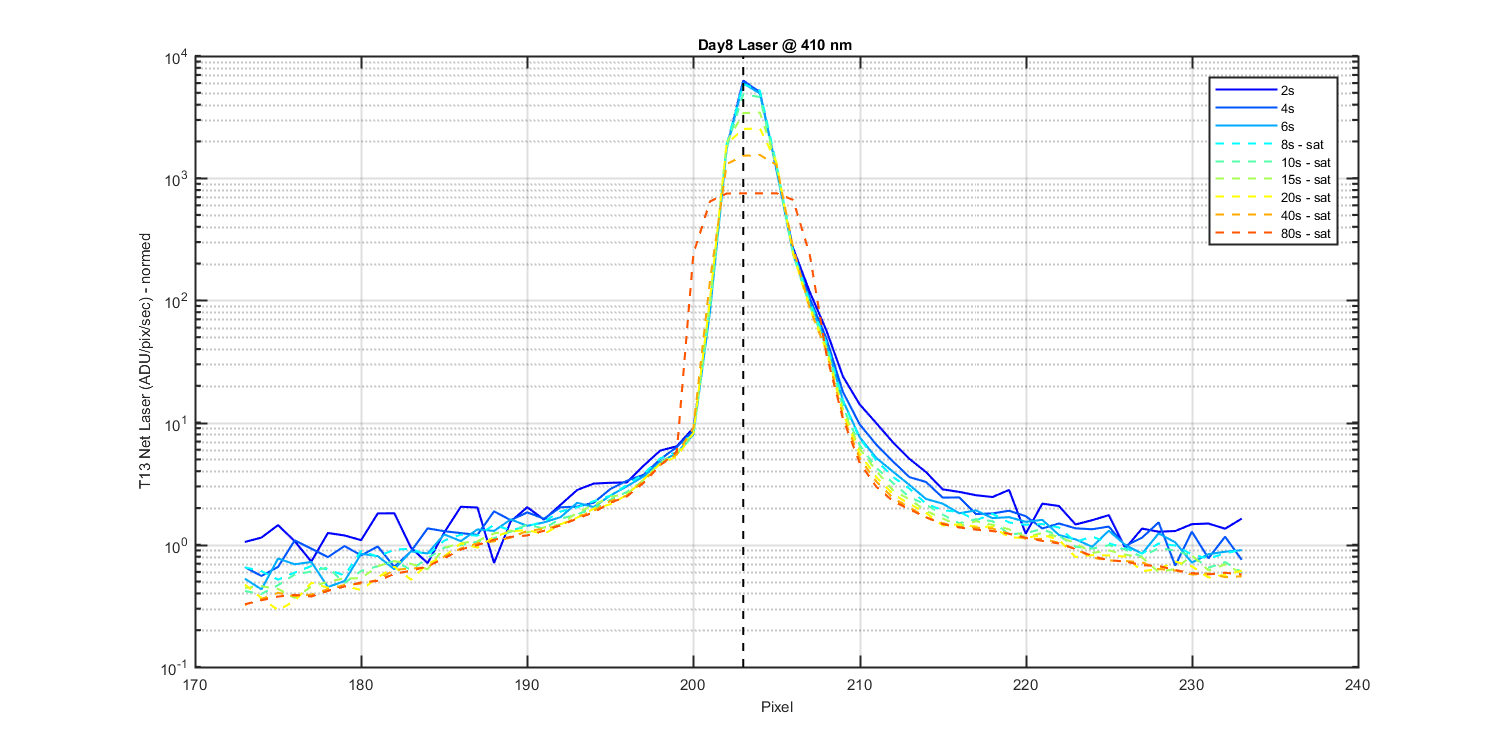
Figure 2
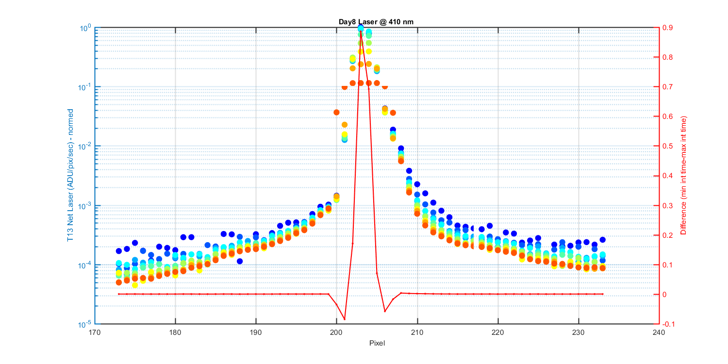
Figure 3
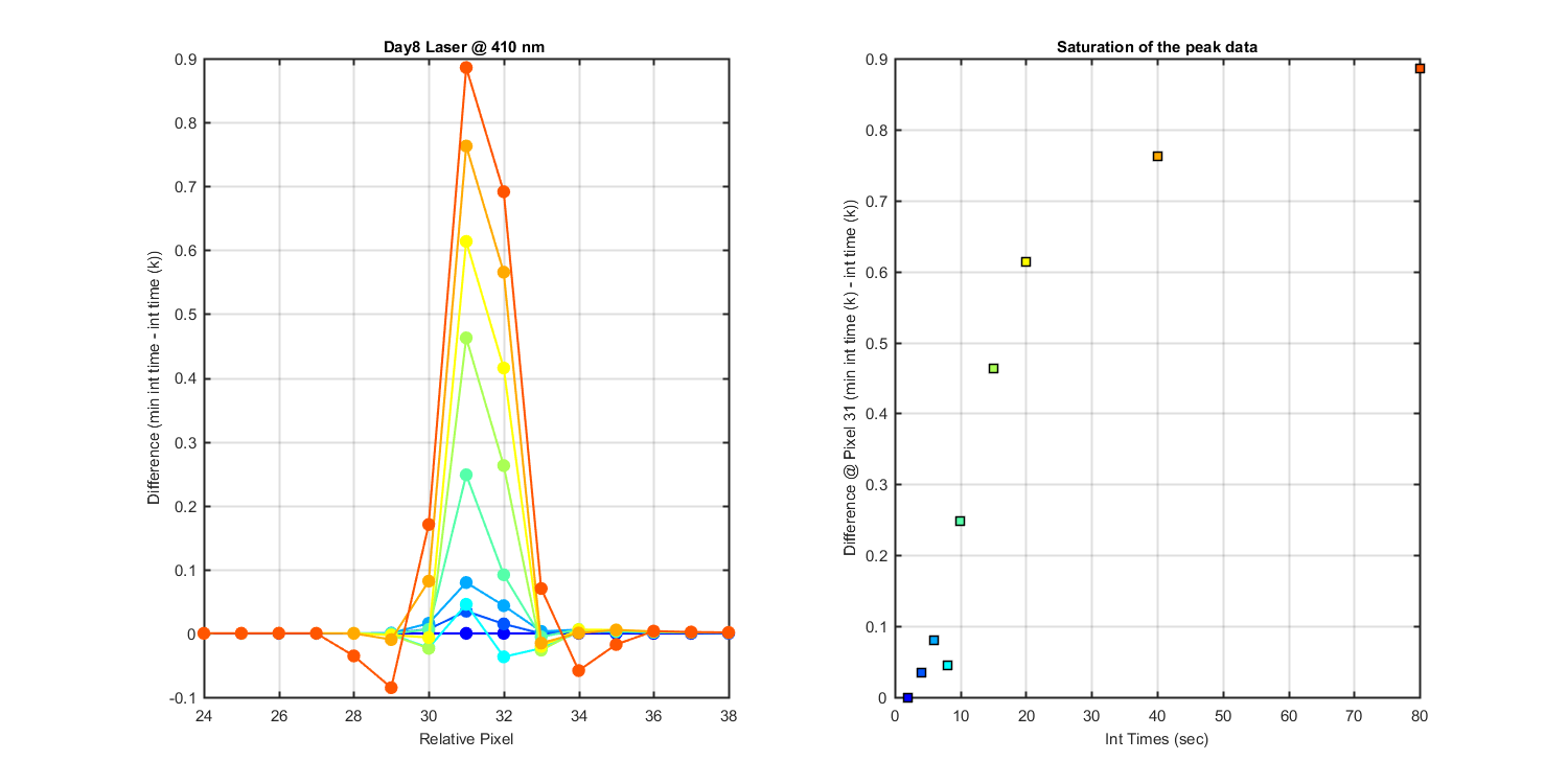
Figure 4
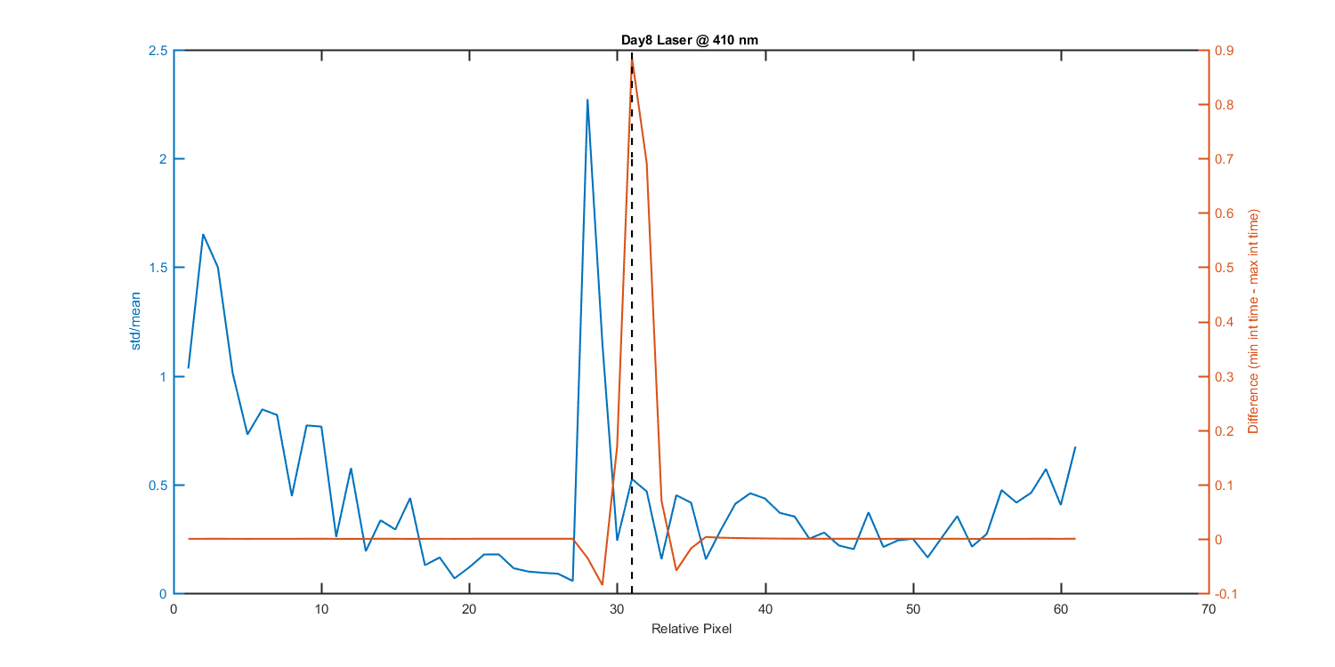
Figure 5