REVISION DATE: 07-Apr-2016 12:56:22
Email from Mike Kehoe on 4 Dec 2015 11:09 am:

Greetings All,

Casey has finished his testing of RS1.  Please find the pre-delivery report attached.  Test data is available at the usual site:

-Mike
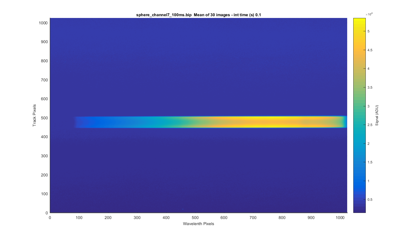
Below are my graphs of the sphere_channel7_100ms.bip file. The file contains 30 dark images at 0.1 sec Note some graphs are dark corrected and some are not so check the axis labels to know what you are looking at.
I took the 30 images and meaned them to get the surface plot below.
Figure 1
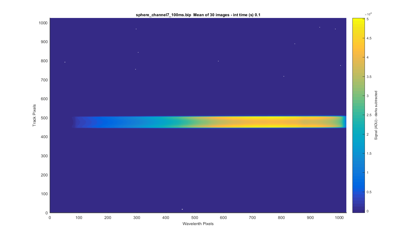
Same as the previous images but with the dark image subtracted. The little white dots are where there where spiked in the darks which where set to NaN.
Figure 2
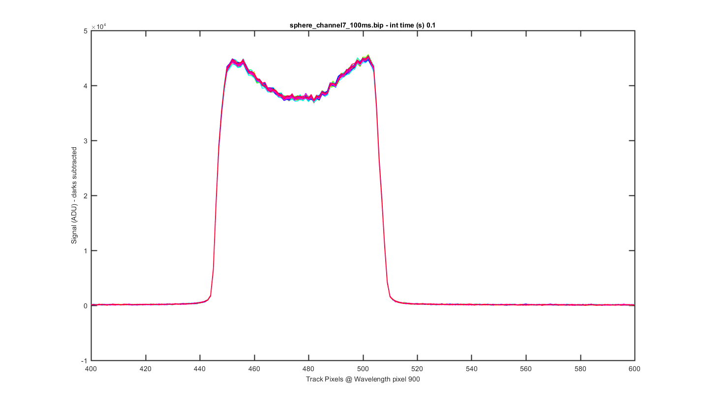
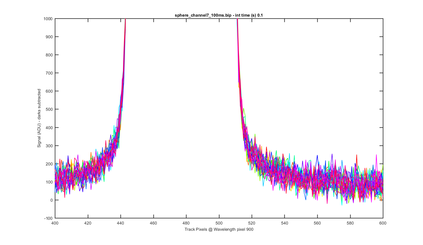
This is a cross section through the tracks at wavelength pixel 900, with one line for each of the 30 images (darks are subtracted).
Figure 3
Same as the previous graph but zoomed into the bottom to see the level of the darks between the tracks.
Figure 4
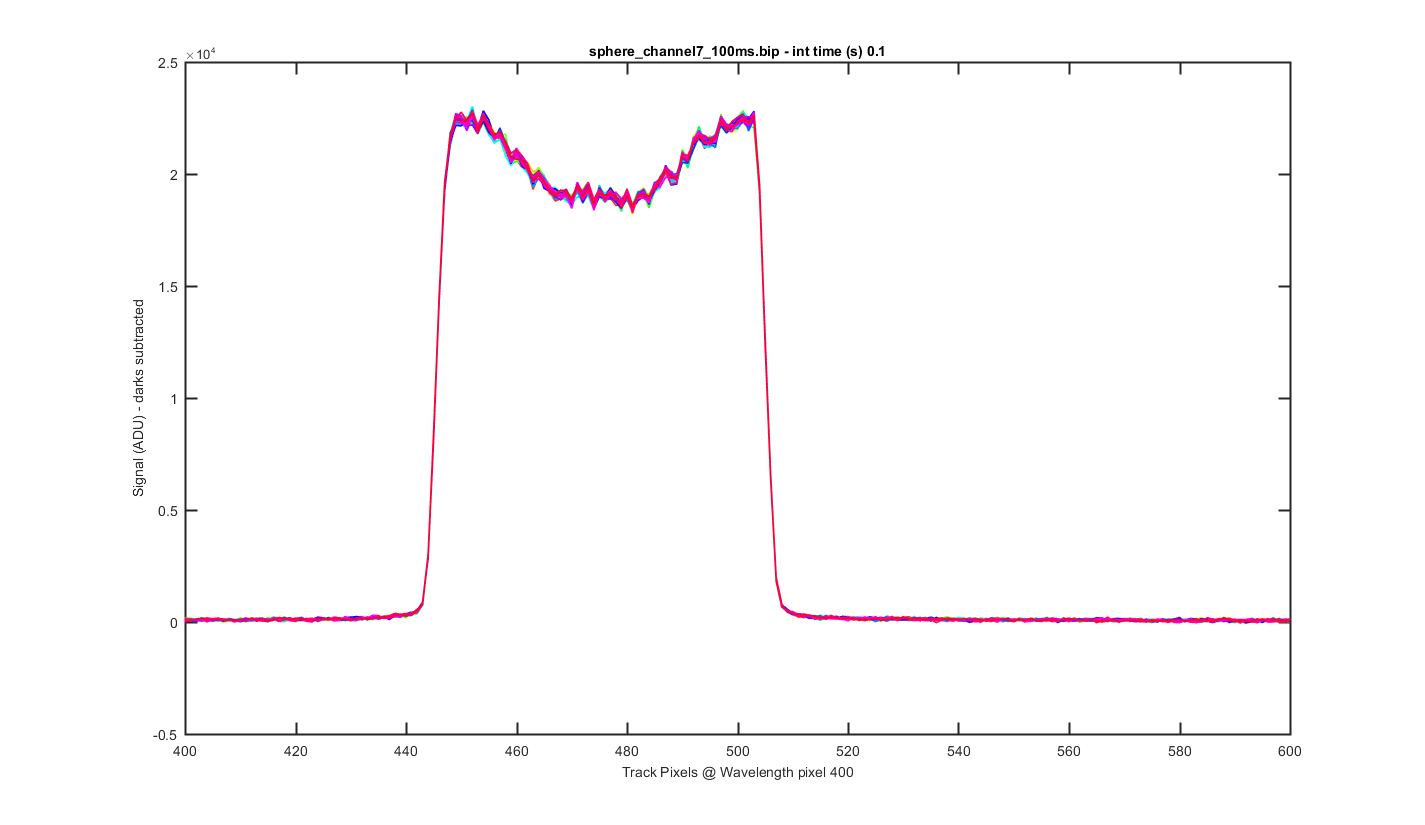
Same as figure 2 but for Wavelength pixel 400 (darks are subtracted)
Figure 5
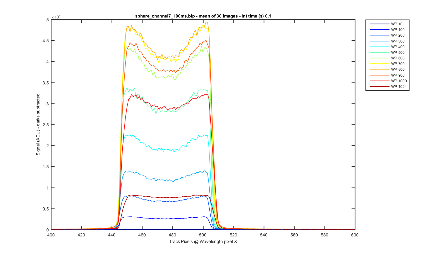
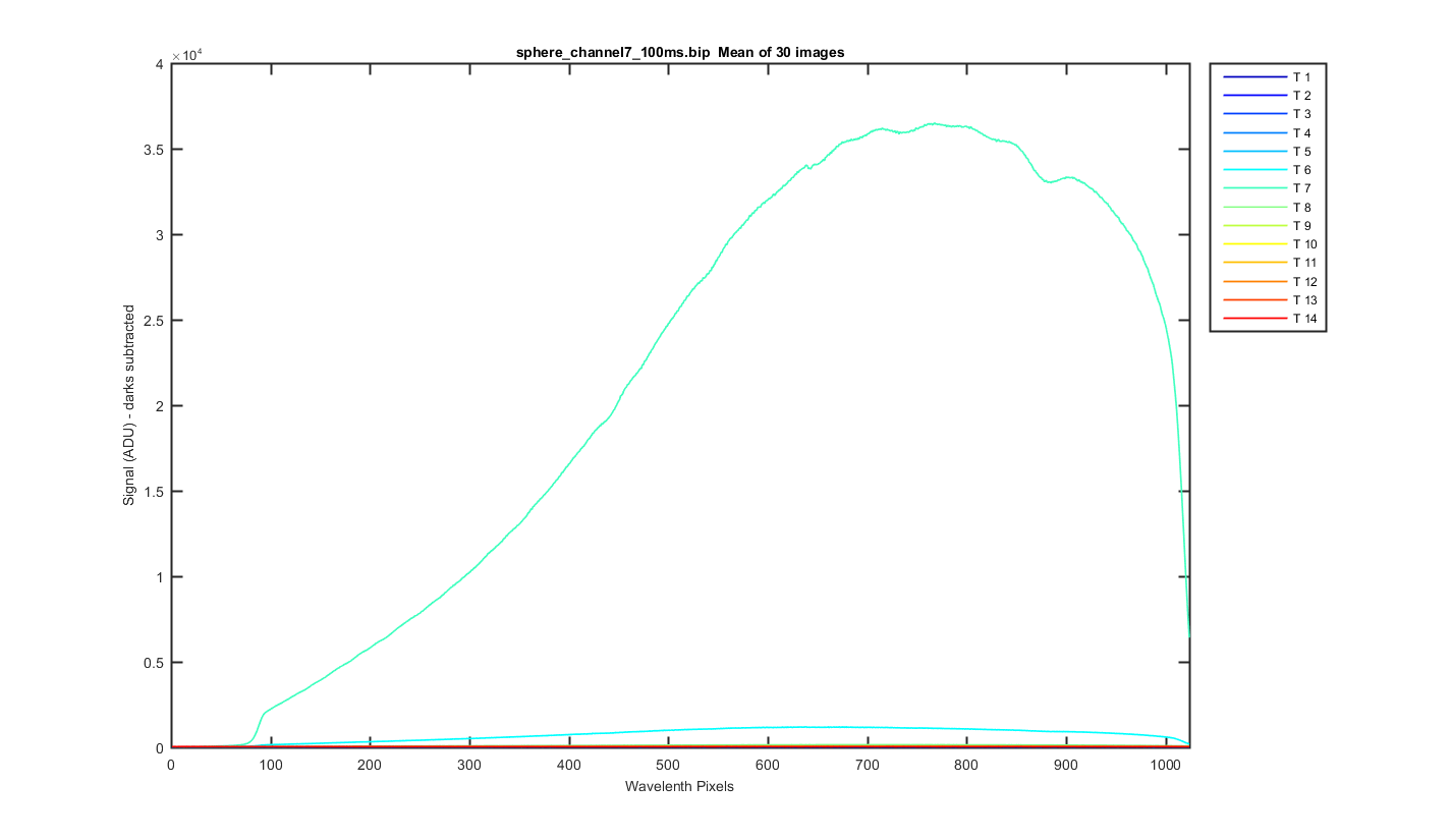
Again this is the mean image with slices thought the image at different wavelength pixels (darks are subtracted).
Figure 6
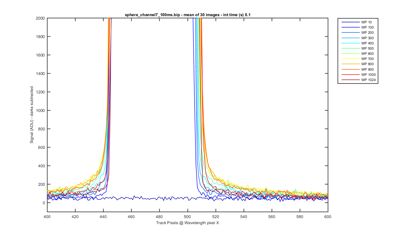
Same as figure 6 but zoomed to the bottom so you can see the darks between the tracks (darks are subtracted).
Figure 7
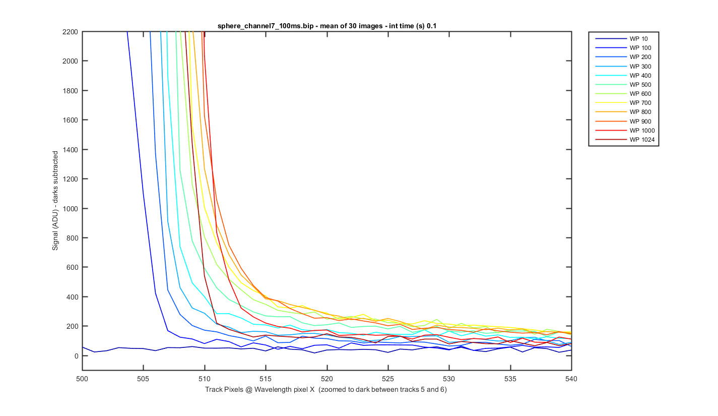
Same as figure 7 but zoomed into the dark area between tracks 5 and 6 so you can see the amount of light getting between the tracks (darks are subtracted). It varies by wavelength.
Figure 8
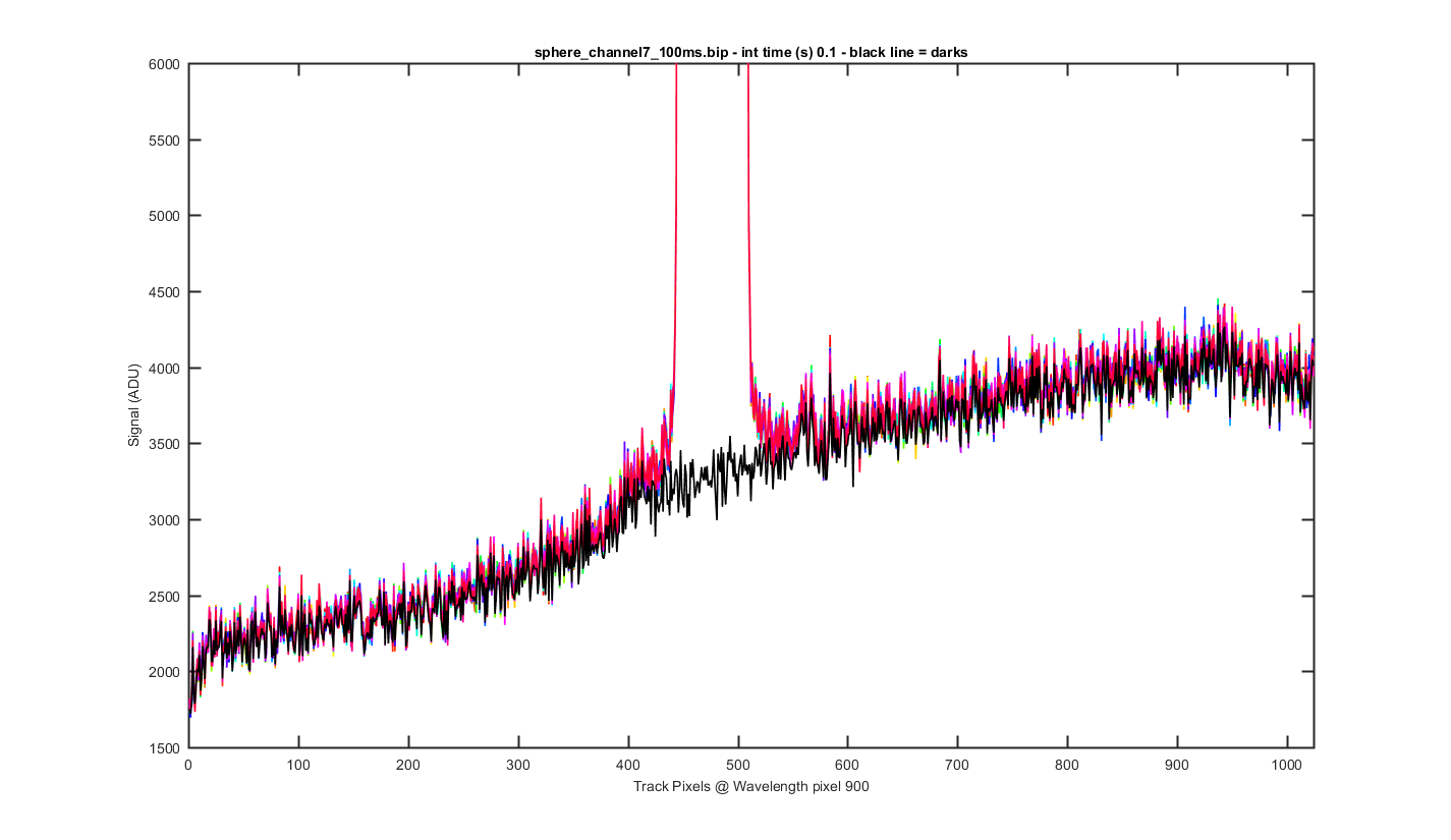
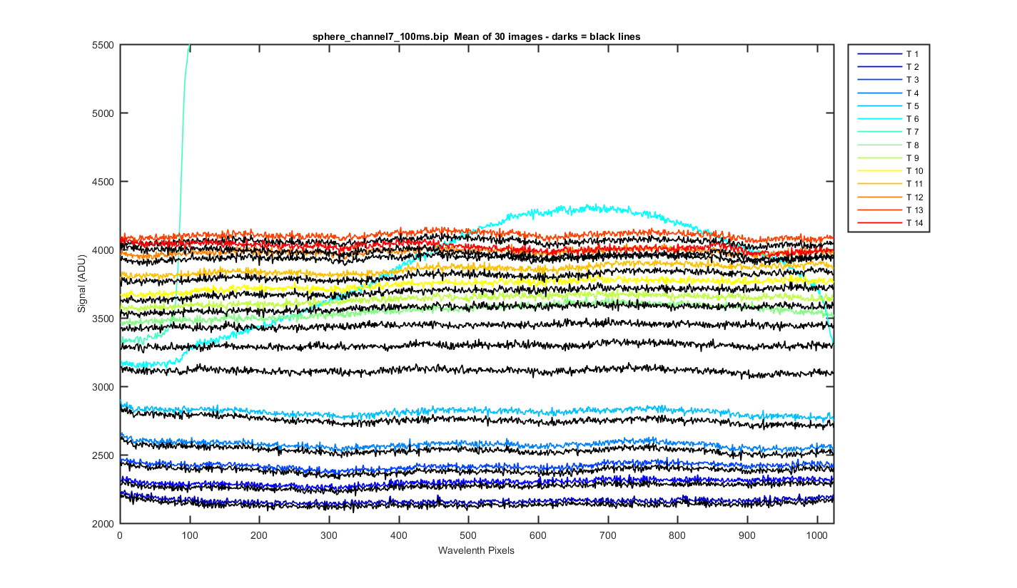
The same cross track plots but zoomed to the bottom and not dark corrected with the dark plotted at a black line (wavelength pixel 900).
Figure 9
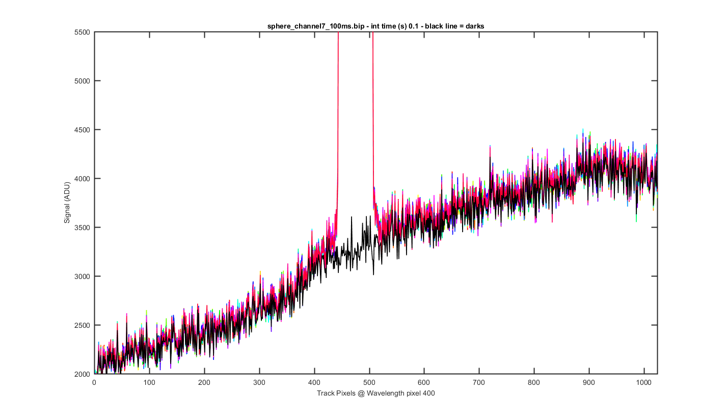
The same cross track plots but zoomed to the bottom and not dark corrected with the dark plotted at a black line (wavelength pixel 400).
Figure 10
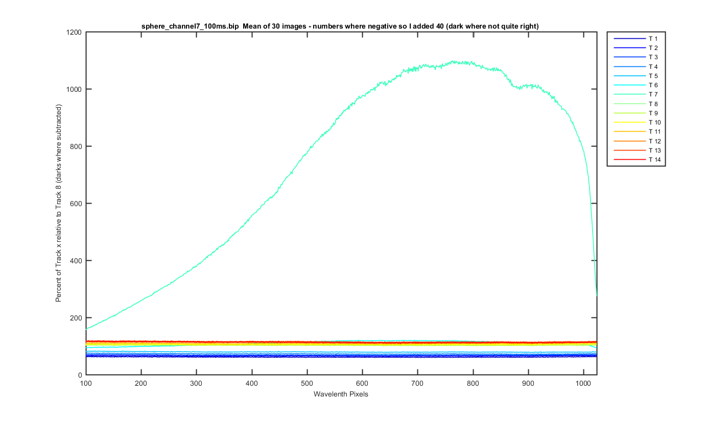
Track data which is dark subtracted, track 8 is the only one illuminated so we can get a cross track percentage
Figure 11
Unfortunatly the darks changed a little from when this image was take and some of the tracks are negative by about 35 ADU,, this means the ratios look weird and huge where the data goes from negative to positive. So for the next graph I added 40 ADU to all the track data.
Figure 12
I calculated the Ratio of each track to track 8 and then multiplied bu 100 to get percentage. Looks pretty good. I also took out the first 100 pixels because the ratio blows up there where the filter cuts on. So less than 2%.
Figure 13