If you have not read the "SPR lesson in-water data" page, read it first. I have removed from this page alot of the background from that page so I can just focus on the new information learned here.
This the same as the page for the in-water data but this is for the lamp signal from LuTop taken during Mike Calibrations.
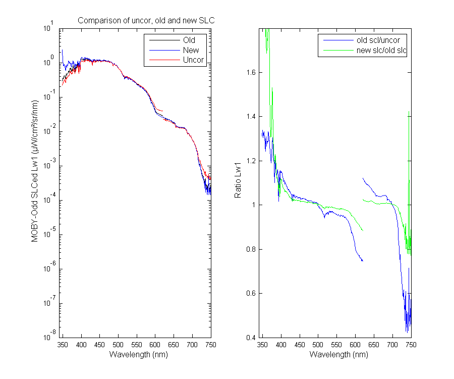
The graph below shows some MOBY data straylight corrected with the old and new SLC and uncorrected. You can see that the new SLC raises the UV significantly.
These data show the effects of the straylight correction on the in-water signal and the calibration lamp signal. When you put the two together (convert the in-water data) the result is the UV changes ALOT!
Figure 1
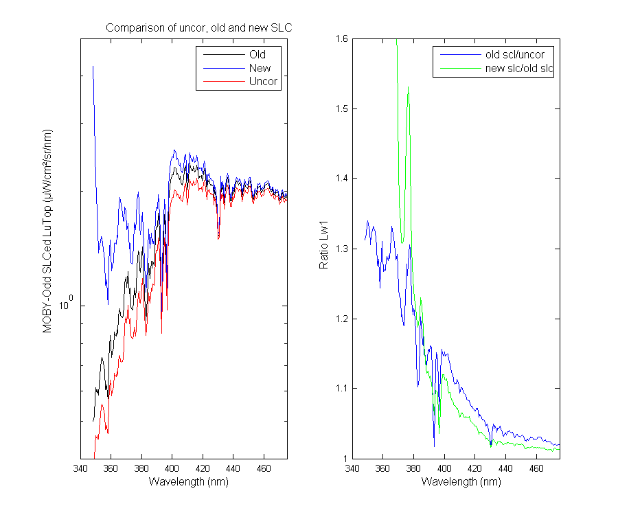
This is a zoomed view of the UV region so you can see the problem better.
Figure 2
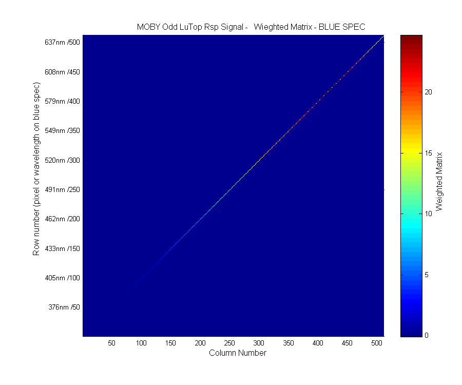
Again, this is the single pixel responsivity or stray light correction matrix.
Figure 3
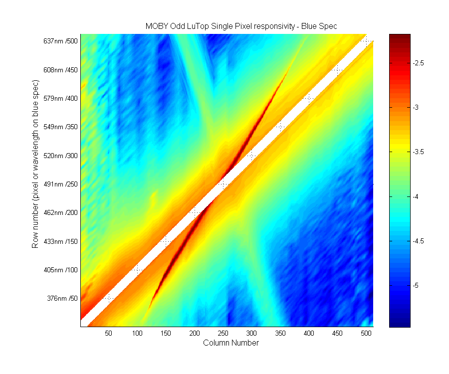
| Pixel Number | 1 | 50 | 100 | 150 | 200 | 250 | 300 | 350 | 400 | 450 | 500 | 512 |
| Wavelength (nm) | 347.9 | 376.0 | 404.7 | 433.5 | 462.4 | 491.3 | 520.4 | 549.5 | 578.7 | 608.0 | 637.3 | 644.4 |
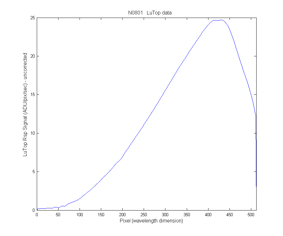
Lamp Caliration data: The following will show how the straylight correction affects the Calibration Lamp signal.
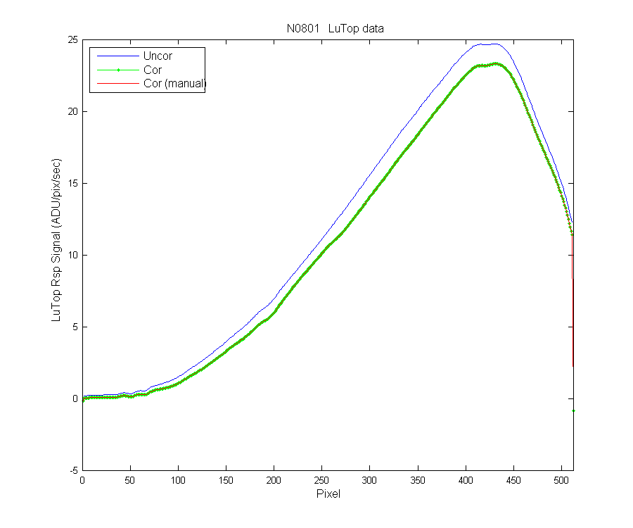
This graph is of the uncorrect LuTop signal (ADU/pixel/sec) during MOBY calibrations with an OL425 (?).
Figure 4
The green line is the answer, the stray light corrected system response. Notice that as in the in-water data the SLCed Cal Lamp signal is lower than the uncorrected.
Figure 5
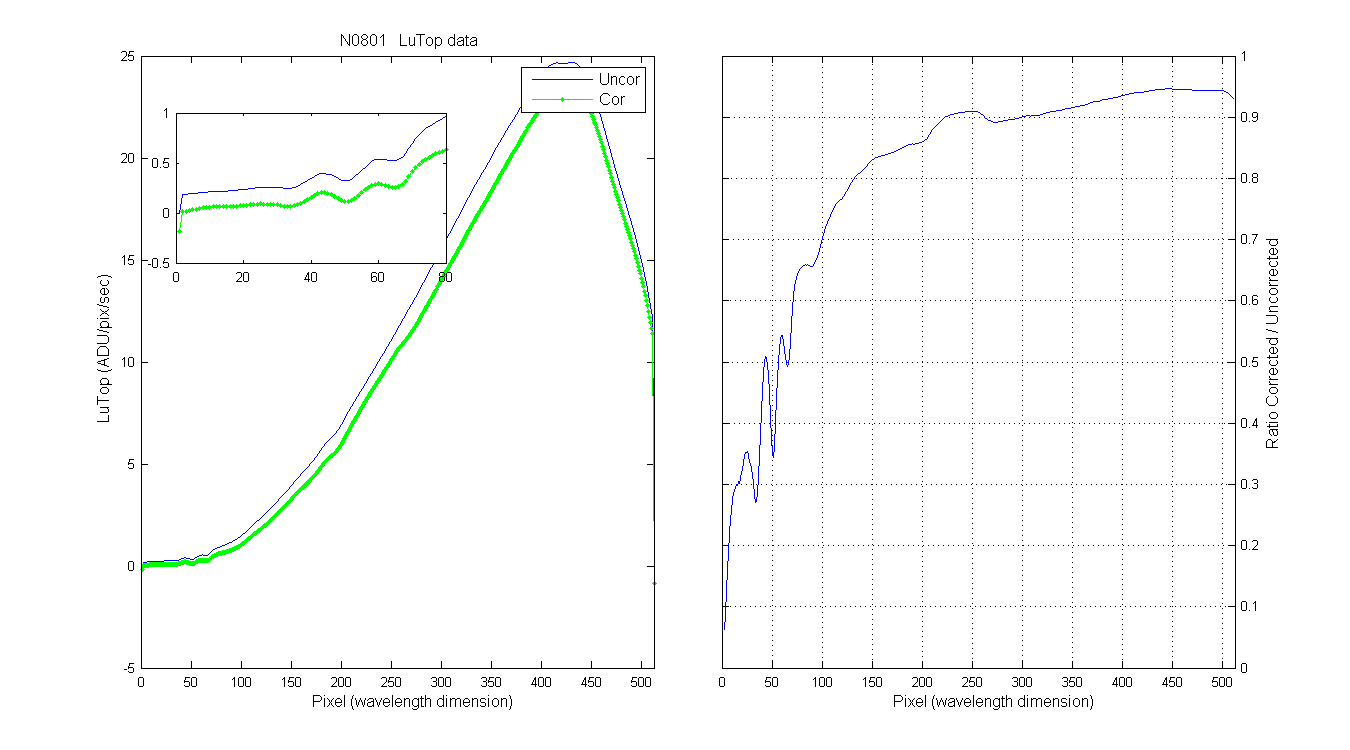
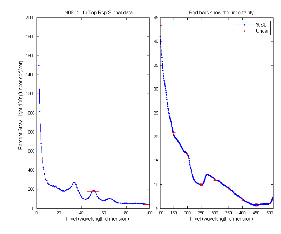
This shows spectrally the percent of the signal which is stray light. This looks very different than the in-water data. For the in-water data the most straylight is in the red (signal is 80% straylight) and for the system response it is in the UV, interesting.
| Pixel Number | 5 | 50 | 100 | 150 | 200 | 250 | 300 | 350 | 400 | 450 | 500 |
| Uncertainty | 10.1 | 5.1 | 1.1 | 0.48 | 0.28 | 0.18 | 0.19 | 0.32 | 0.32 | 0.32 | 0.33 |
Figure 6
Email from Mike - how he calced the uncertainies:
Oh boy, I'd LOVE to see an approximate uncertainty band on Fig.6 !
11 errorbars would do the trick !
The first component would be scan acquisition SNR.
for pre-cal MOBY245 LuTop, ±5pix avg of 1/SNR*100
pix#=[ 5 50 100 150 200 250 300 350 400 450 500 ]
%unc=[ 1.6 .92 .37 .23 .19 .14 .13 .10 .10 .10 .13 ]
( nm 350 376 405 434 462 492 520 549 579 608 637 )
Second = SLC: I'm looking at the Monte Carlo Fig.18 from our SLC paper
where 350nm unc ~10% @ Pixel #1, dropping to ~5% @ 375nm or Pix#50,
then down to ~1% @ 400nm or Pix#100, to a min ~0.1% @ 500nm ~ Pix#250,
back up to ~2% @ 600nm = pix#450, and ~8% @ 650nm = pix#500.
...
I'm also looking at Steve's SPIE 2007 unc Table.1 - did he get from you
data for the "Stray Light" row ?
I interp1() from Table.1
nm [ 411.8 442.1 486.9 529.7 546.8 665.6 ]
%u [ 0.75 0.3 0.1 0.15 0.3 0.3 ]
at
nm=[434 462 492 520 549 579 608 637]
...
I get something like
( nm 350 376 405 434 462 492 520 549 579 608 637 )
pix#=[ 5 50 100 150 200 250 300 350 400 450 500 ]
%unc=[ 10 5 1 .42 .21 .11 .14 .3 .3 .3 .3 ]
Of course, the Monte Carlo estimate was for the old "modeled" SLC,
and for Lw - not just cal lamp ADU (Fig.6 here) -
so it truly "represents an upper-bound on the uncertainty".
This work of yours will re-define and certainly reduce that estimate.
RSSing SNR & SLC gives unc = sqrt(unSNR.^2 + unSLC.^2)
pix=[ 5 50 100 150 200 250 300 350 400 450 500 ]
unc=[10.1 5.1 1.1 .48 .28 .18 .19 .32 .32 .32 .33 ]
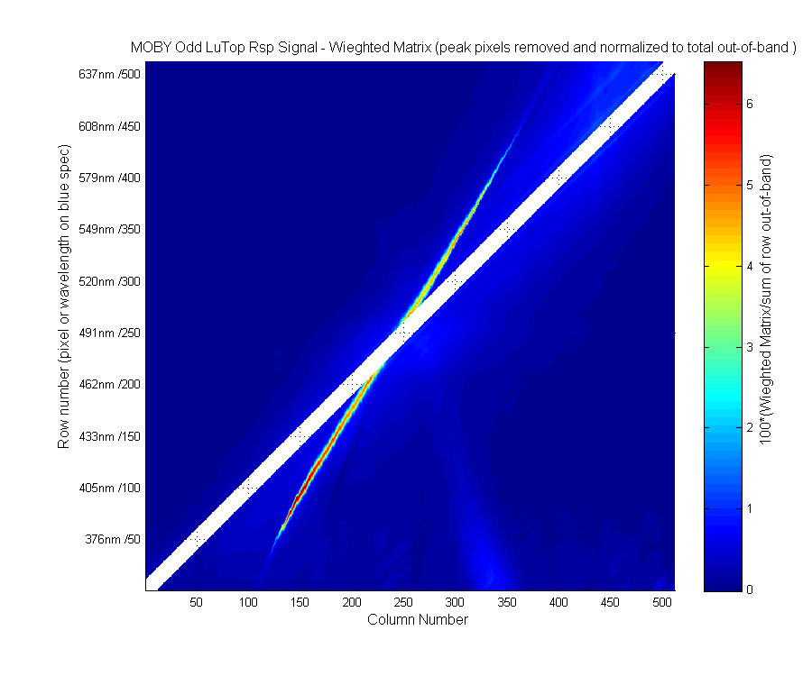
The image below shows the weighted matrix (ADU/pix/sec) , you can see that most of the signal is in the diagonal in-band area. Note: The bright dots down the diagonal are not real and don't exist in the Matlab figure intil printed.
Figure 7
To check to make sure I had done the math right I summed each row and plotted the manual corrected data below. Looks good.
Figure 8
Next I wanted to look at the out-of-band data and replot the weighted matrix in some meaningful way. So I removed the in-band data, and divided each row by the sum of that row and multiplied by 100. The sum of that row (with the in-band removed) is the total straylight. So what I ended up with is a image of the percent of the total straylight for each pixel row by row. The image below shows the percent straylight of the wieghted matrix.
Note the large bump is more important in the UV (row 1-100 ish) than it was in the in-water data.
Figure 9
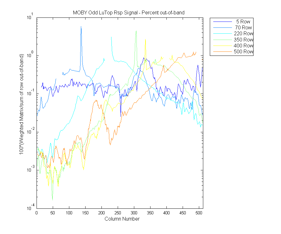
The below plot is the line plot of the image above. Now it is a little easier to see which area of the spectrum contributes the most to the straylight for any row in the matrix, which is a one pixel/wavelength in the straylight corrected spectrum.
Figure 10
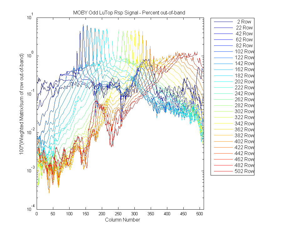
Same graph as above but for more wavelengths.
Figure 11
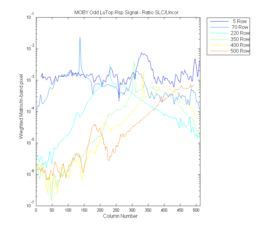
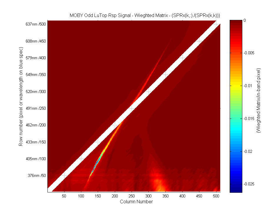
This graph is similar to Figure 9 but rather than getting rid of the in-band, I divided the entire row by the in-band pixel for that row (ie I divide row 10 by pixel 10). If you sum the rows in this figure you get the ratio see in figure 5s right panel.
Figure 13
The below plot is the line plot of the image above. Now it is a little easier to see which area of the spectrum contributes the most to the straylight for any row in the matrix, which is a one pixel/wavelength in the straylight corrected spectrum.
Figure 14