REV date: 01-Jul-2014 14:50:29
Deployment Saturation Check
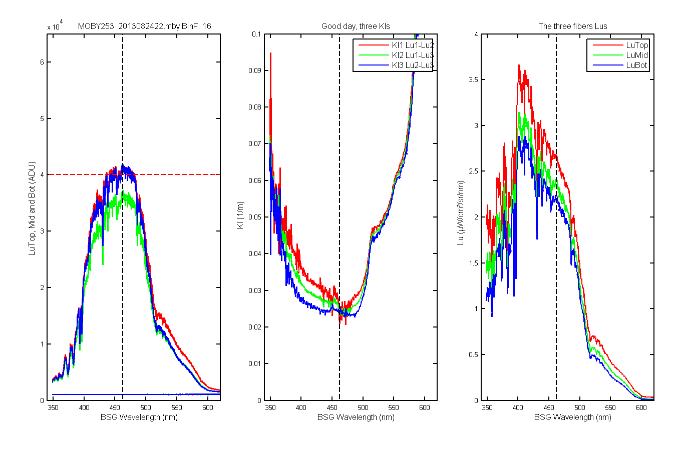
At the beginning of Deployment 253 the bin factor for the Lus were changes from 12 to 16. This bumped up The ADU values to near or over 40,000 ADU. This would not be a problem if the image filled the CCD but it does not. So the data are saturating and we needed a know how bad it was. Ken used Mikes CCD images and guess that the saturation should start around 37,000 ADU for LuTop. We looked at the data and did not really see any problems until closer to 40,000 ADU. Mark and Marco then changed the MOBY parameters to fix the problem on M253. The first set of graphs below will show you the problem. The saturation is most evident in the Kls. You will see them get noisier around the area of saturation and they will reverse their order.
In the left panel is the data in ADU. Anything over 40,000 ADU (red dashed line) are saturated. The middle panel shows the Kls. You can see around the dashed black line the red Kl dips down below the blue and visa versa. The LuTop and Bot in this case are saturated so the using only one of them shows the effect the most. This is a pretty mild case.
Figure 1A
This shows a more clear case of saturation in the Kls. The Kls actually reverse themselves for a good chunch of the middle of the blue.
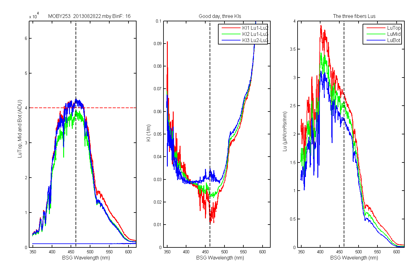
Figure 2A
So the question became has this happened before and we did not see it. I dont remember seeing the Kls doing this before. But to get an idea I looked at the max value (in ADU) for all deployments and bin factors. You can see the time series graph below. The red dots are the max value for that deployment and bin factor. Below will be graphs of each of the data points and their Lu and Kl data.
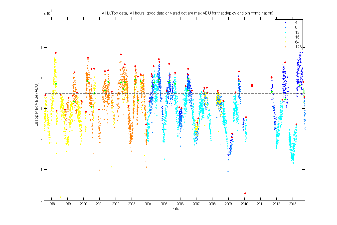
Figure 1B
As you zip through these you will see that only 253 shows the signs of saturation. Also note the lower the bin factor the higher th chance of saturation.
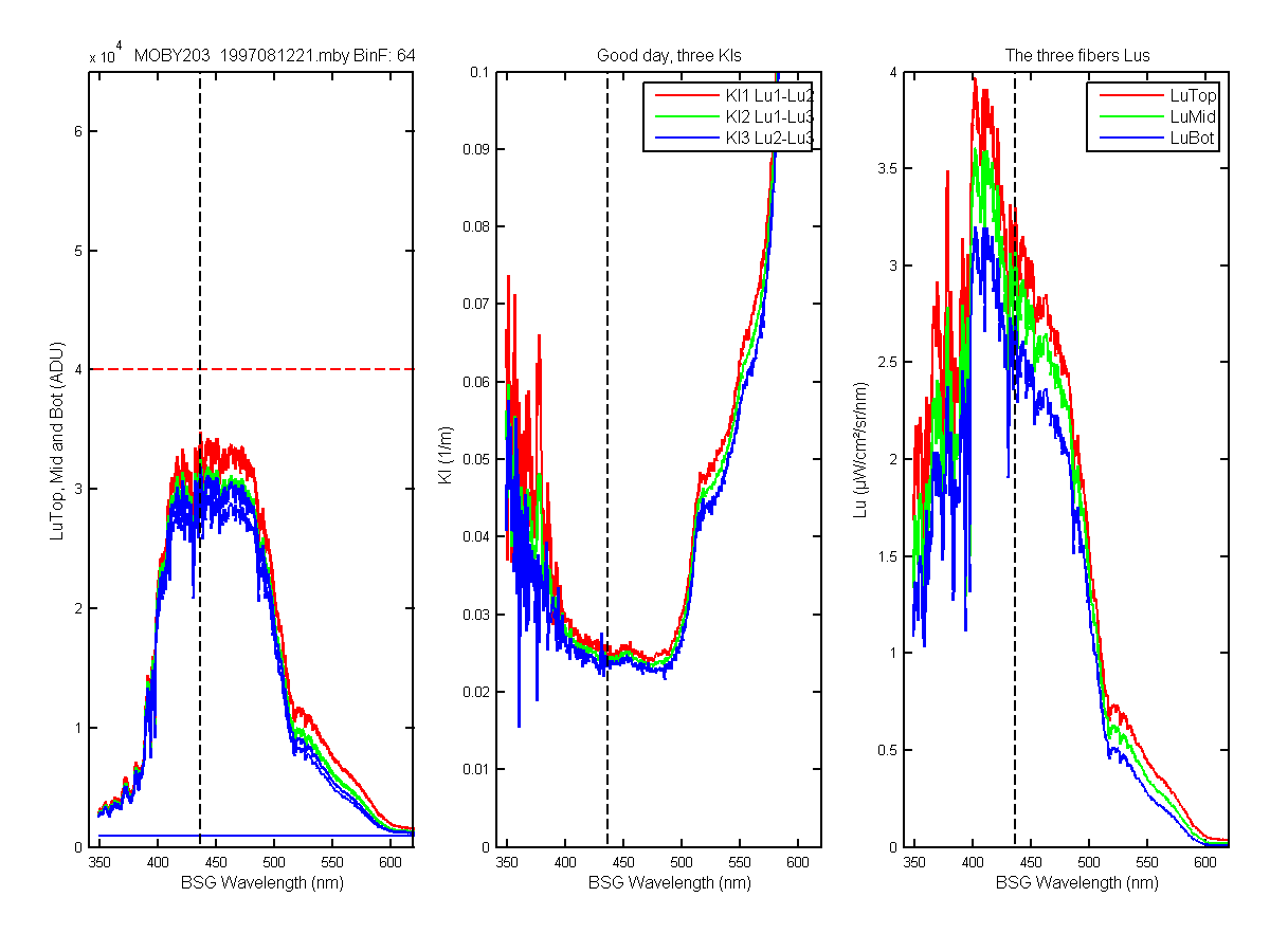
Figure 1C
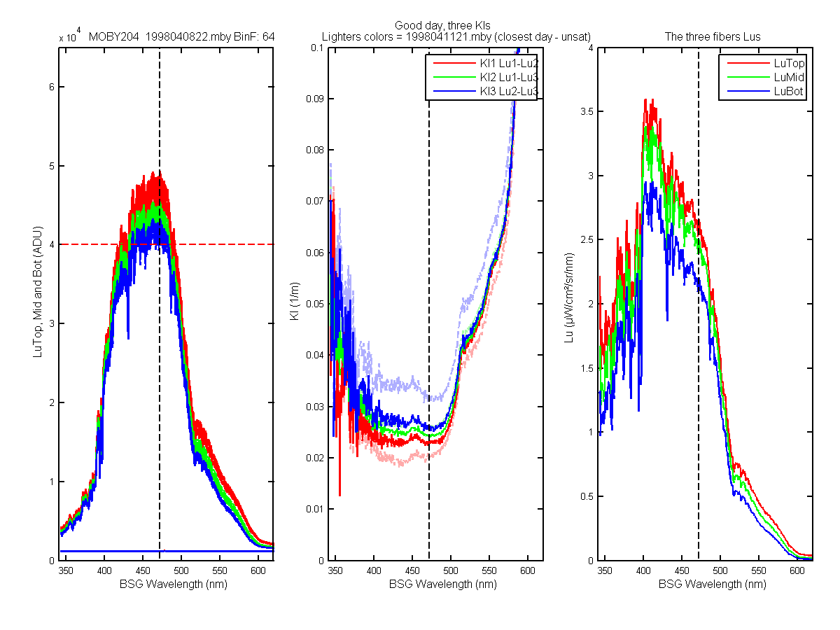
Figure 2C
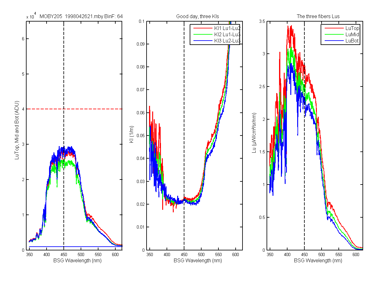
Figure 3C
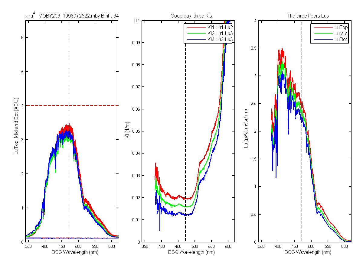
Figure 4C
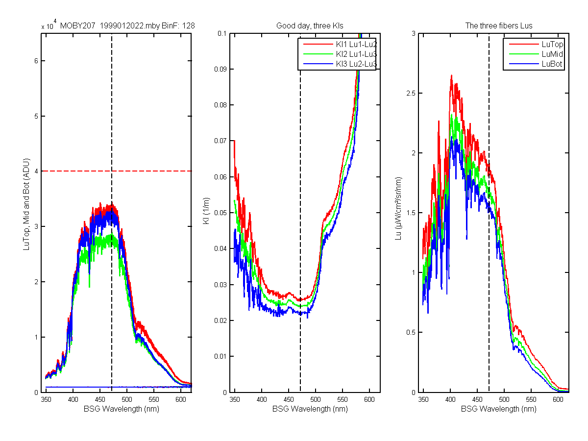
Figure 5C
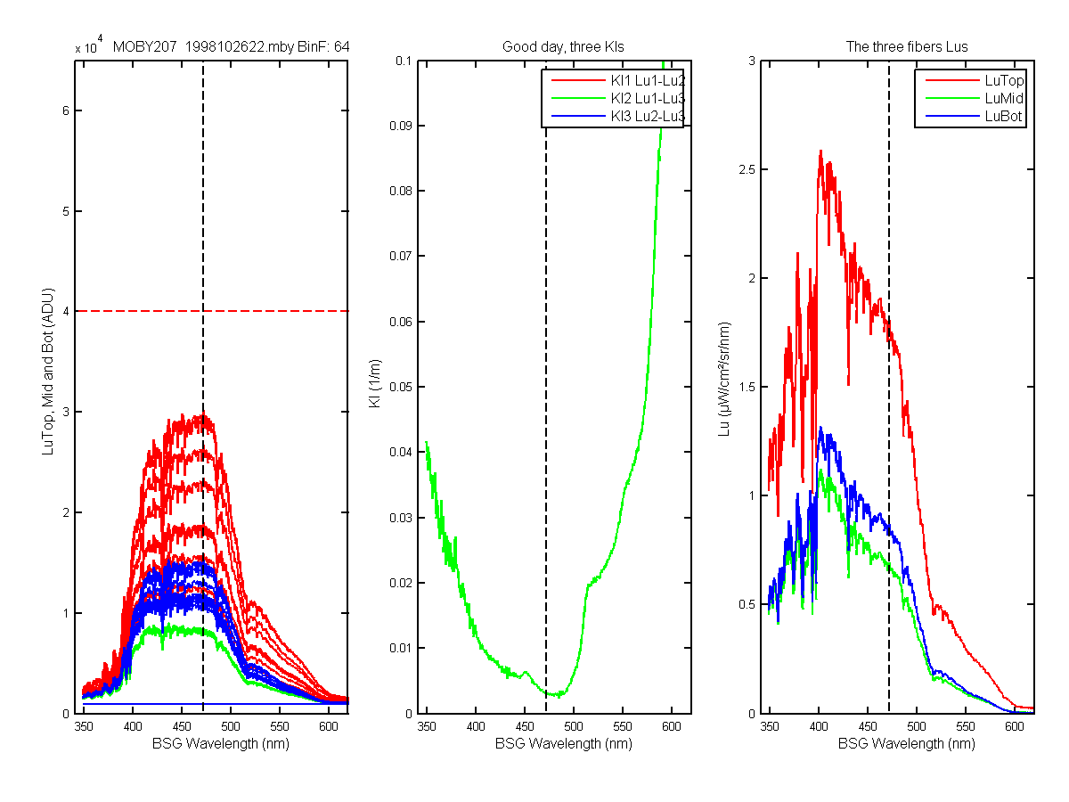
Figure 6C
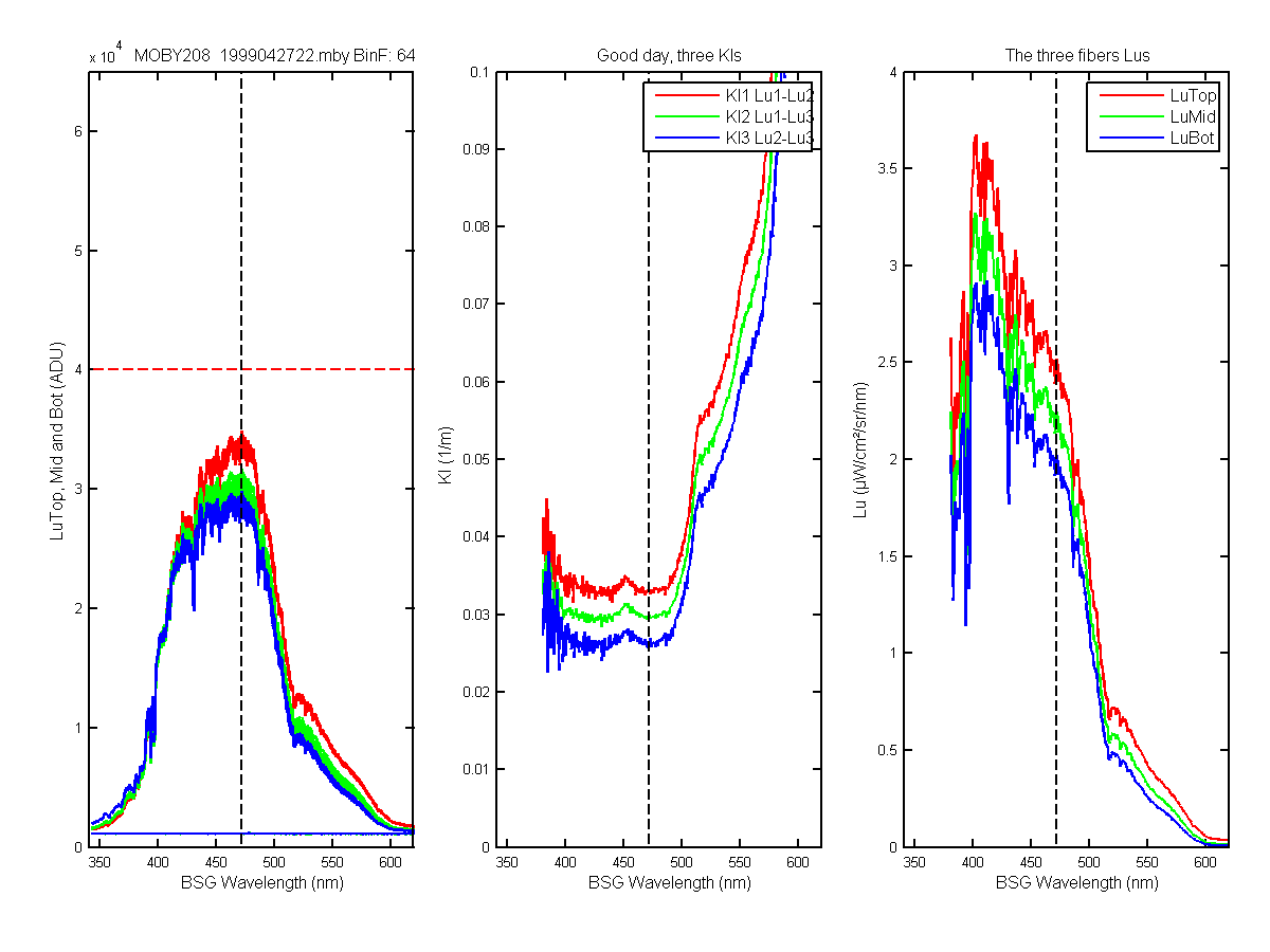
Figure 7C
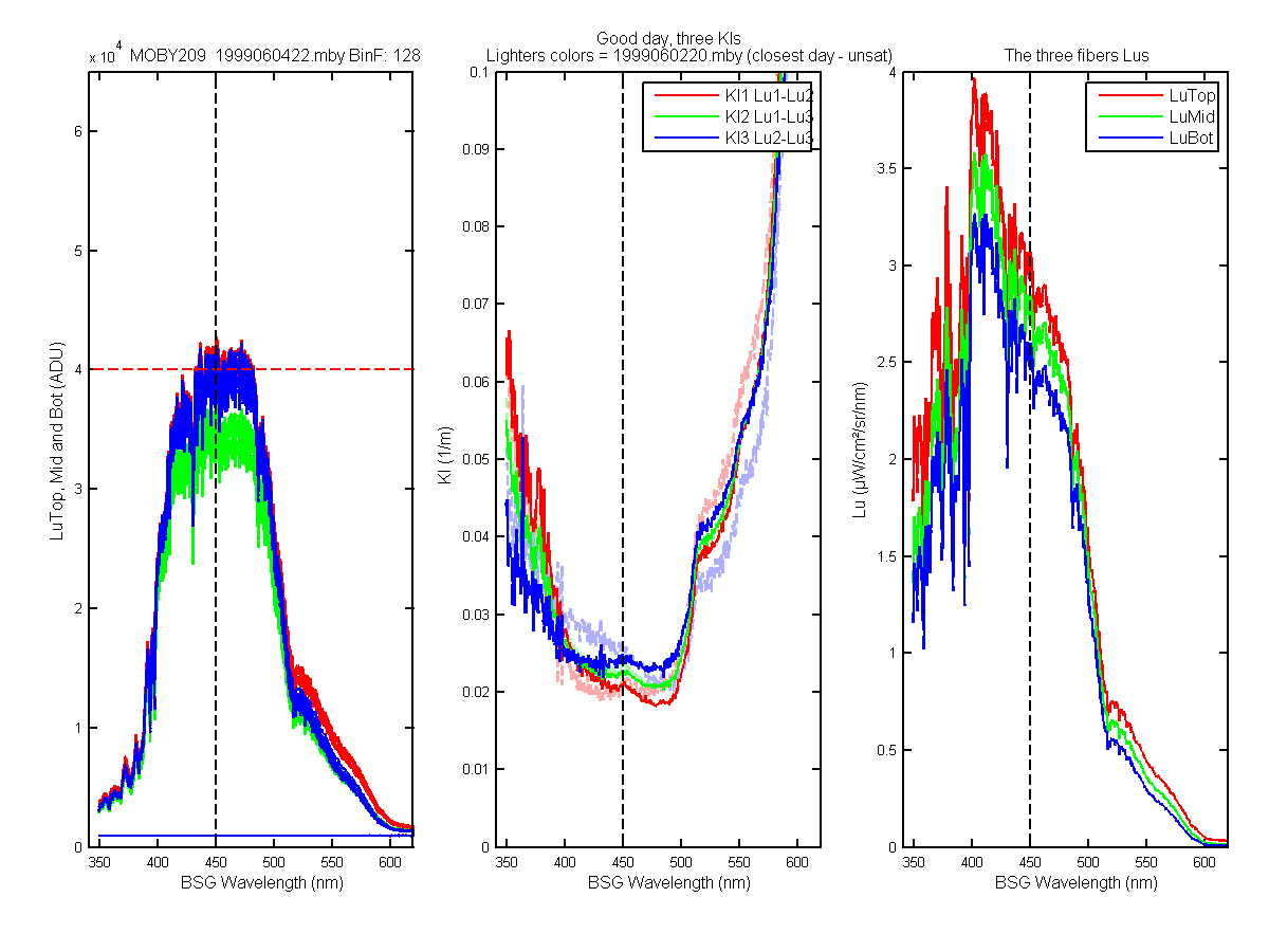
Figure 8C
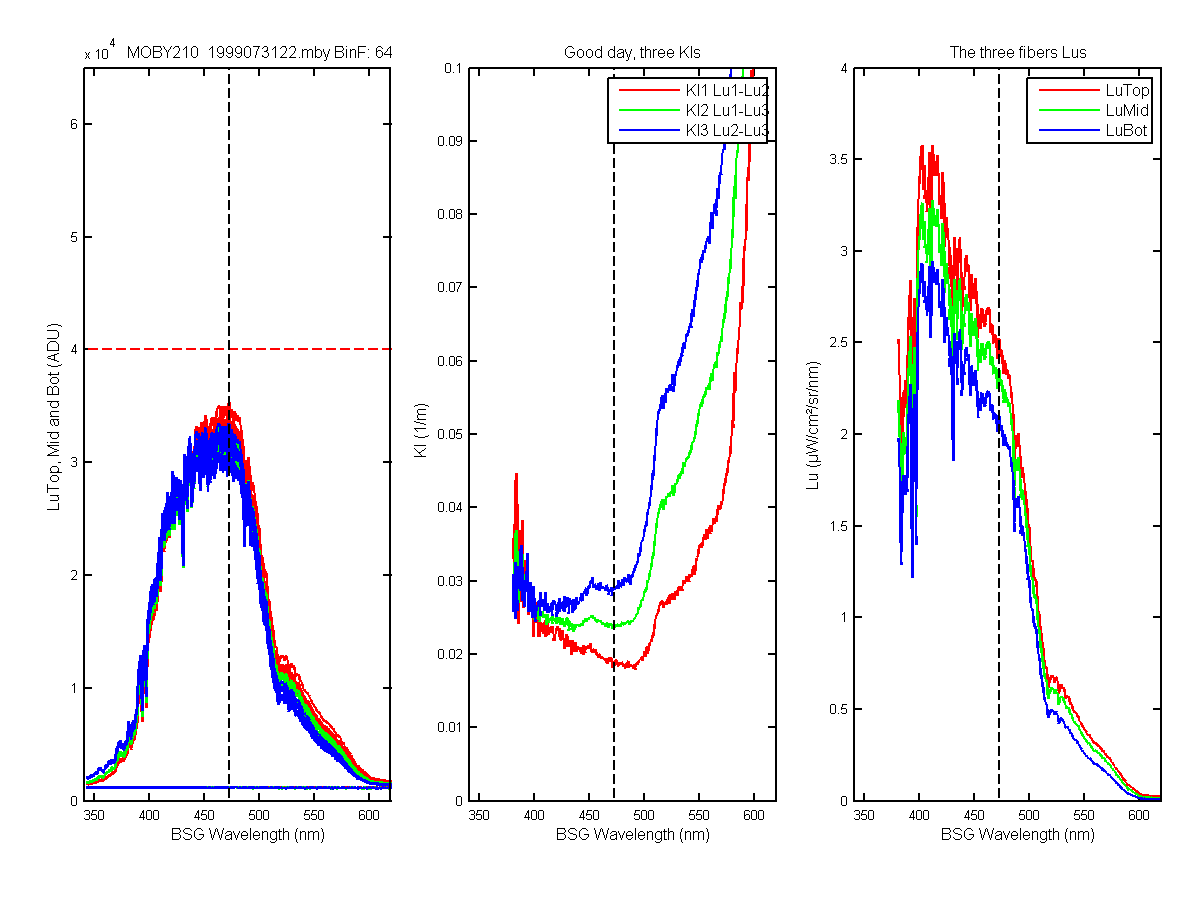
Figure 9C
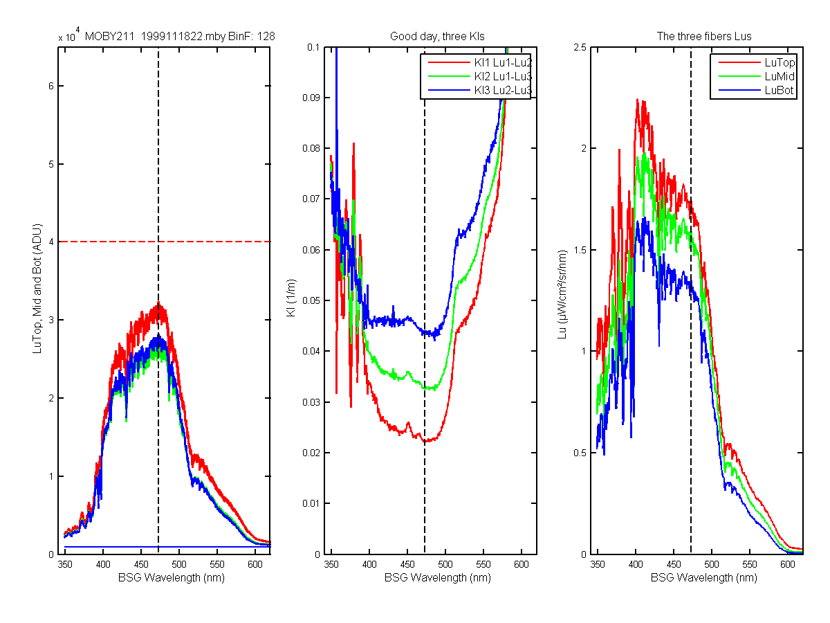
Figure 10C
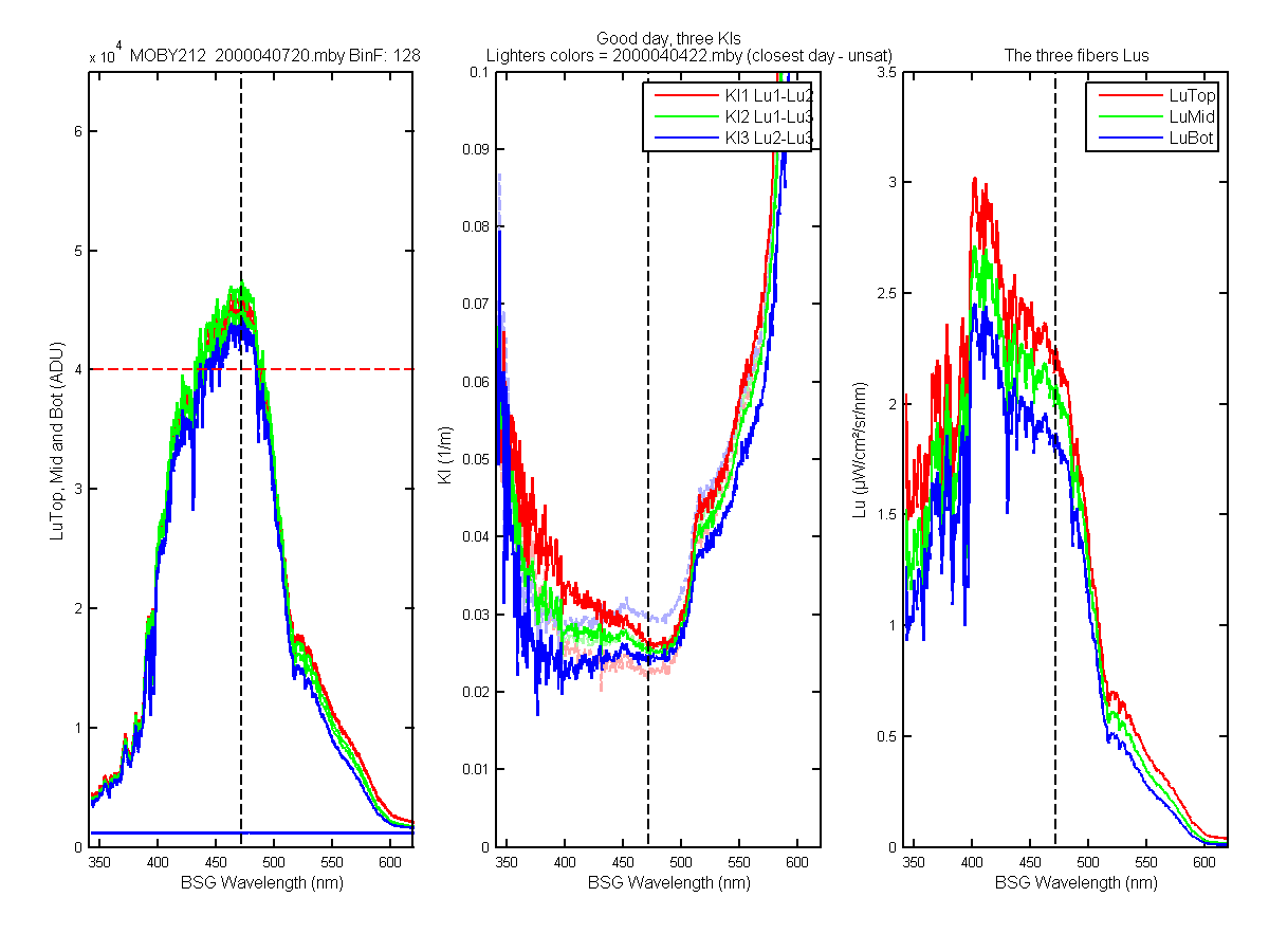
Figure 11C
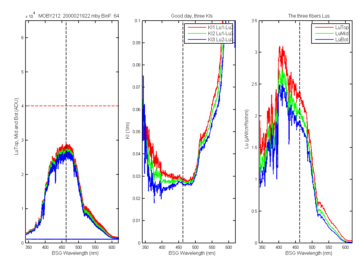
Figure 12C
Figure 13C
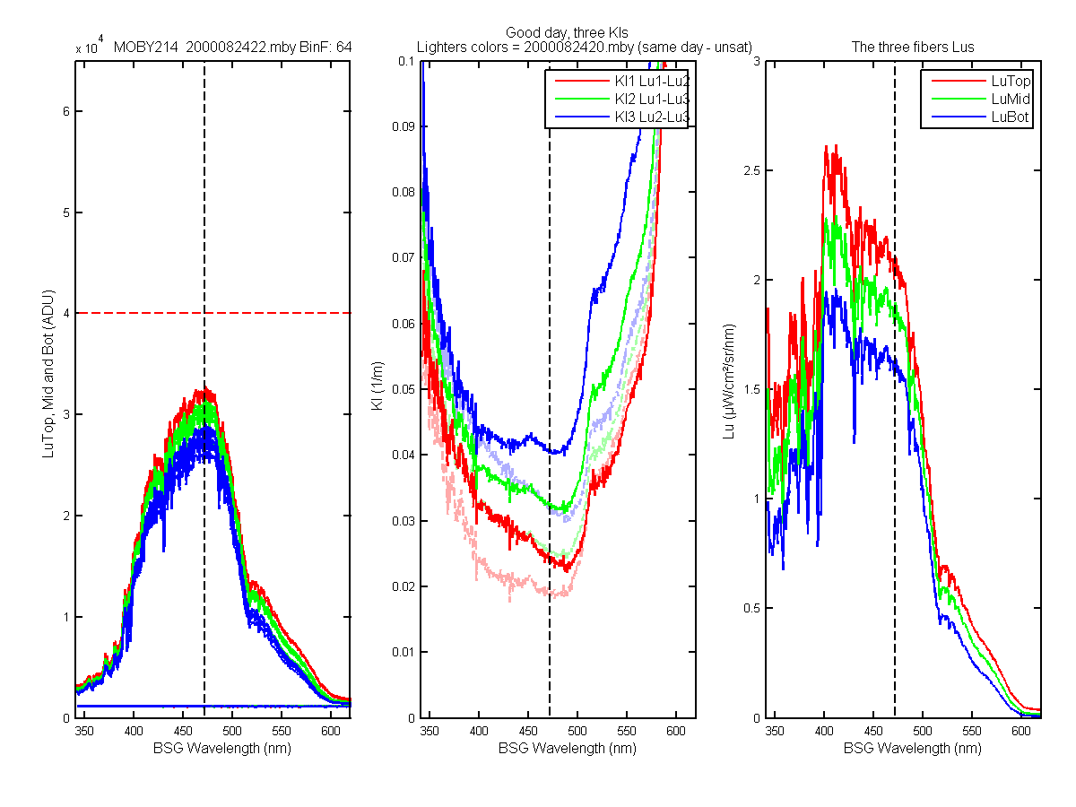
Figure 14C
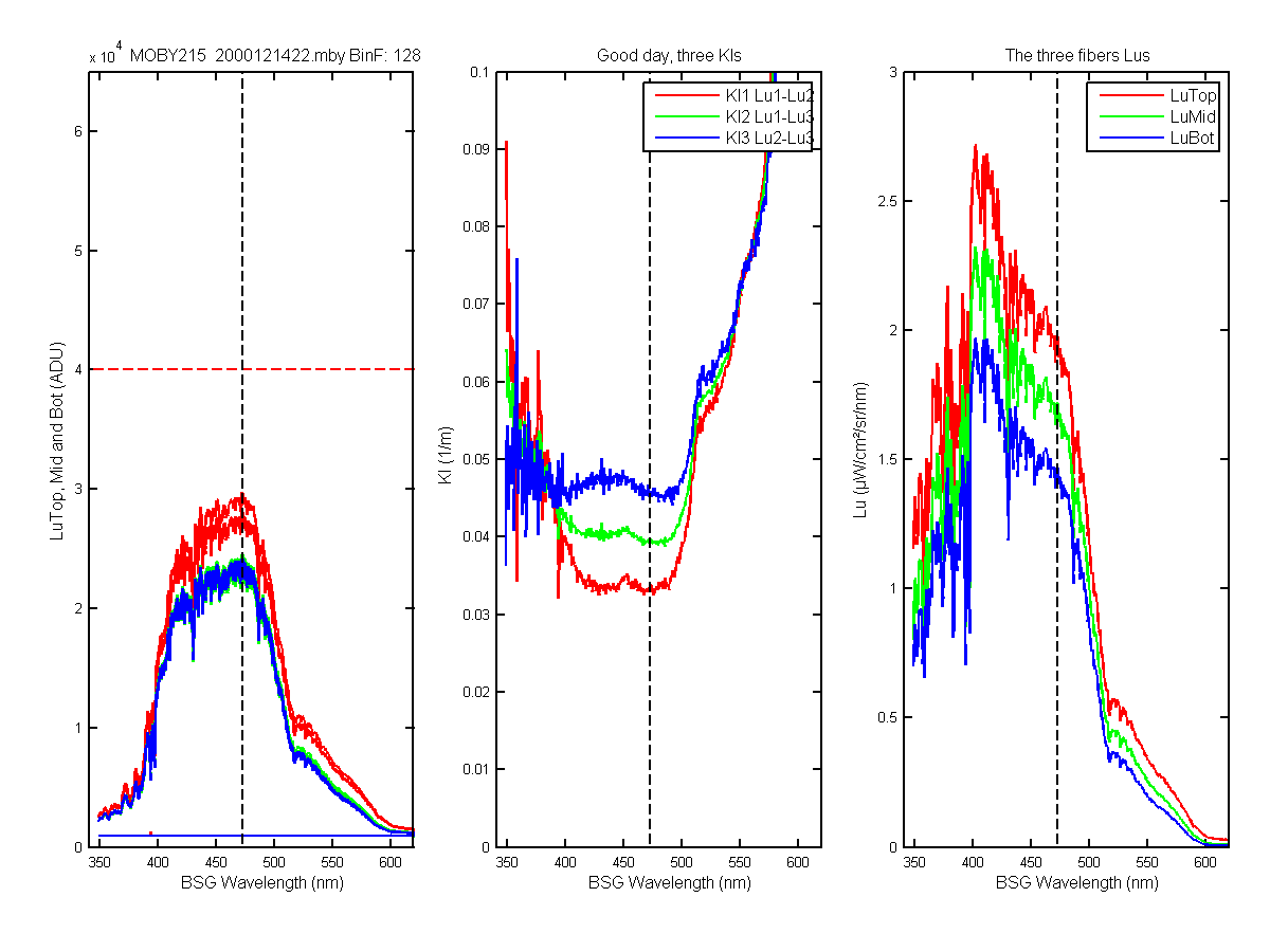
Figure 15C
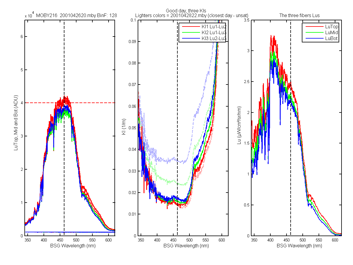
Figure 16C
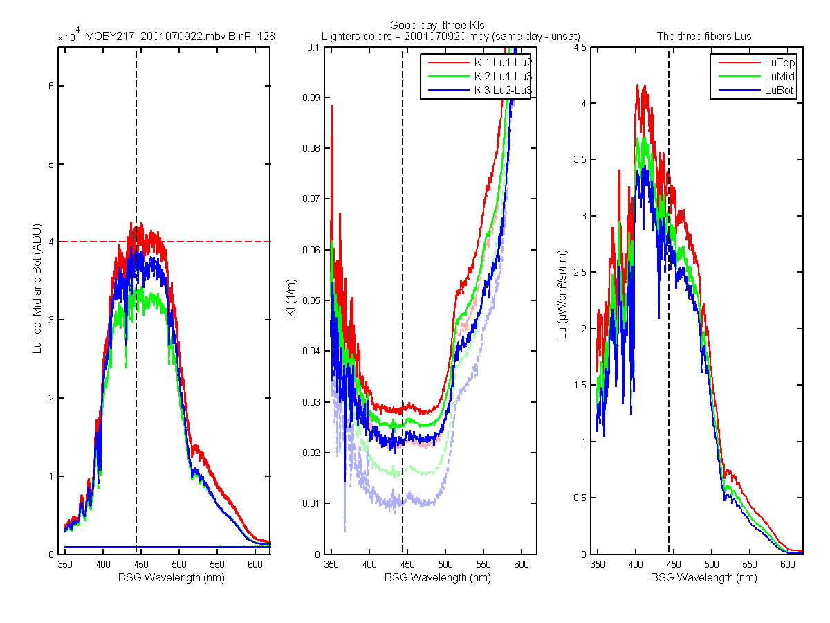
Figure 17C
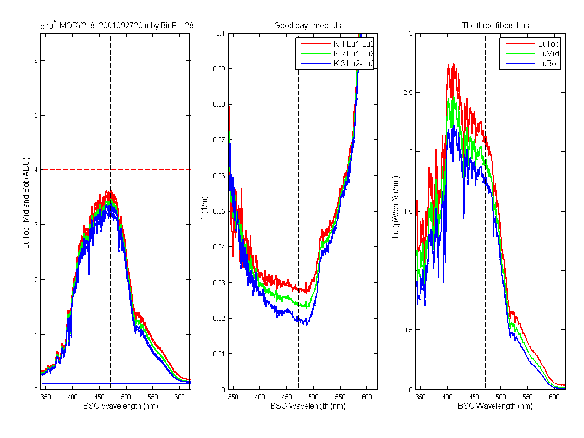
Figure 18C
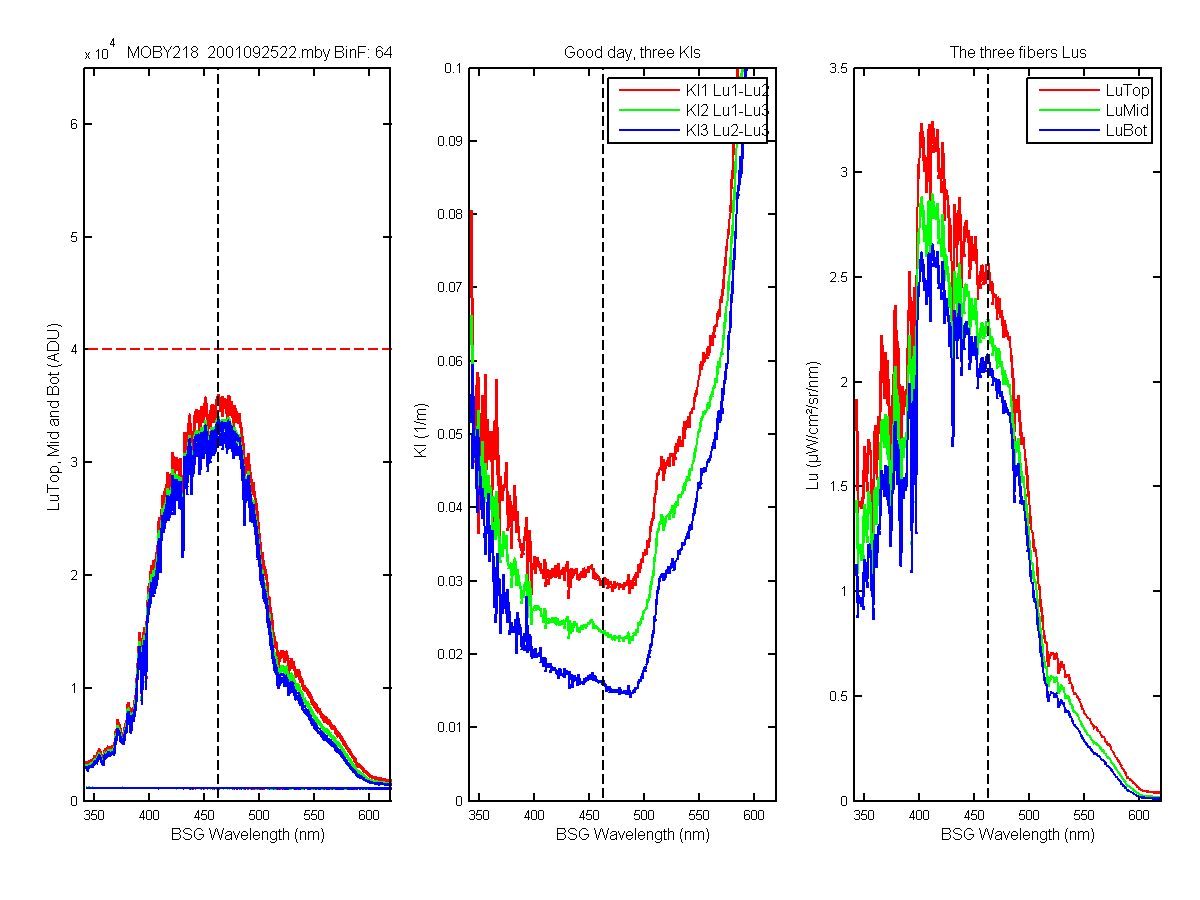
Figure 19C
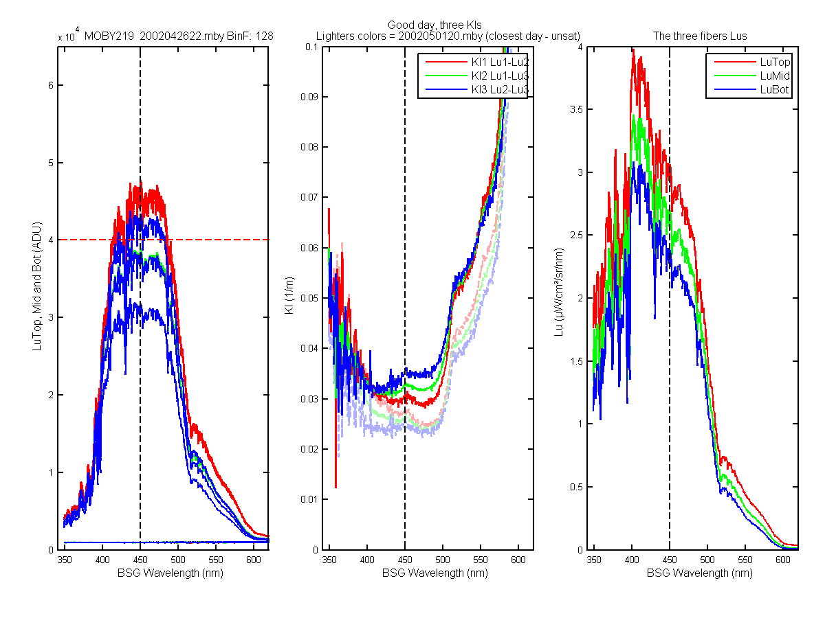
Figure 20C
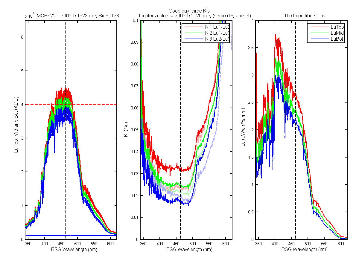
Figure 21C
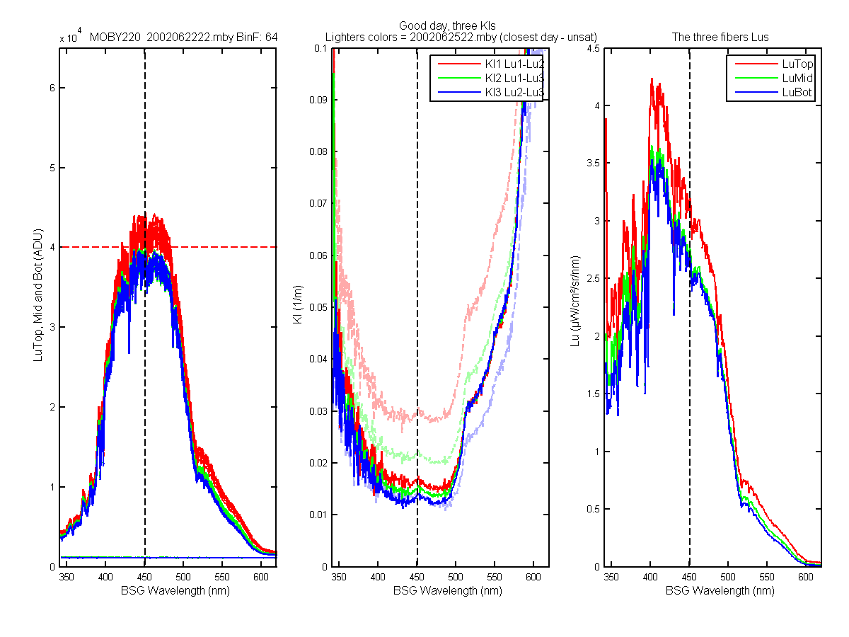
Figure 22C
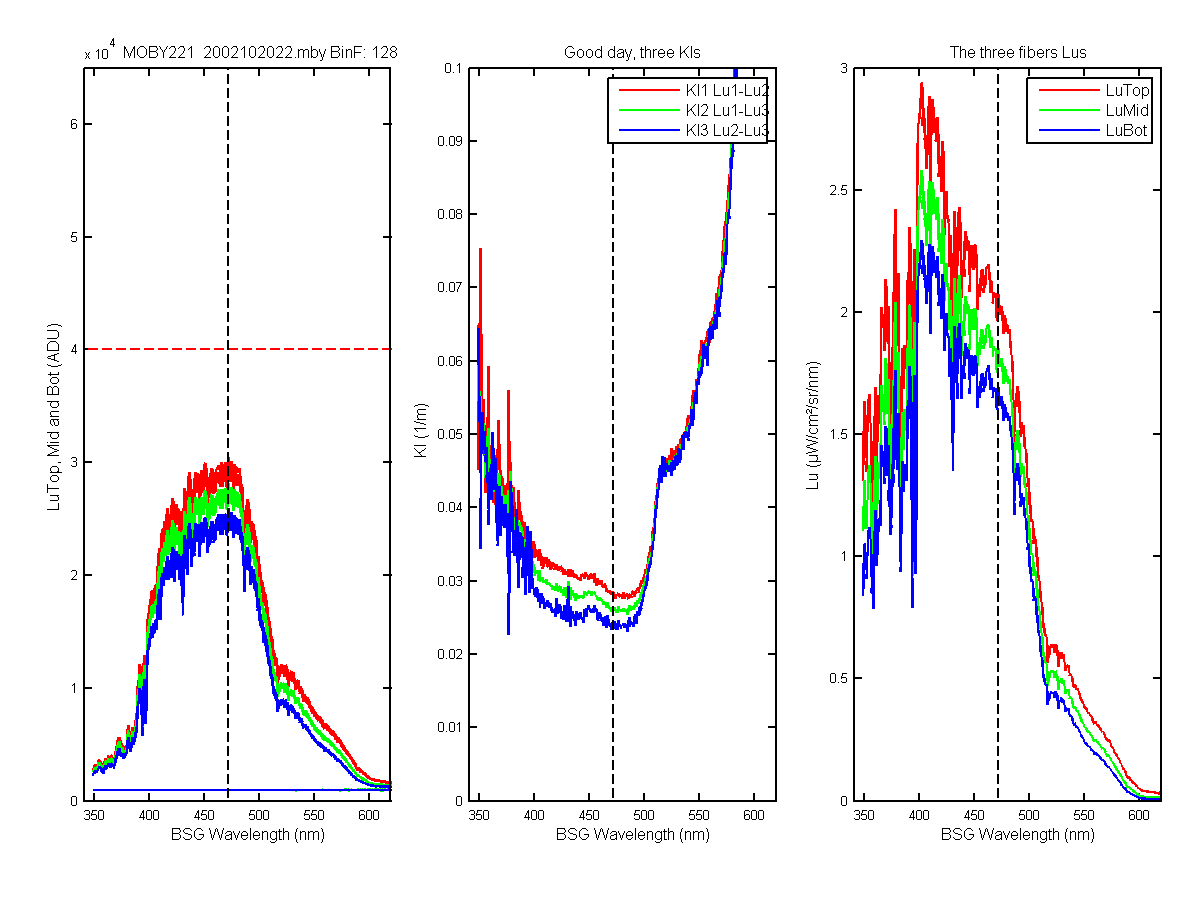
Figure 23C
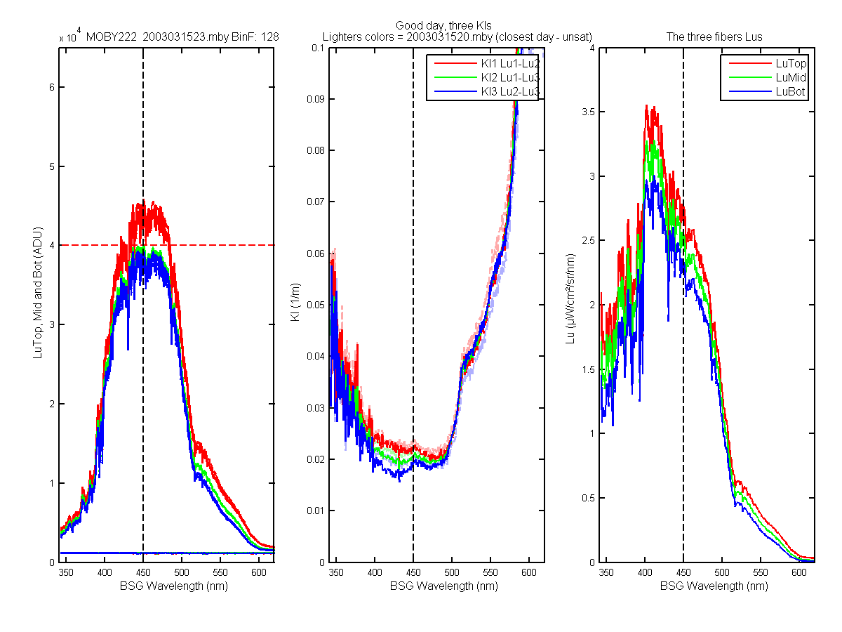
Figure 24C
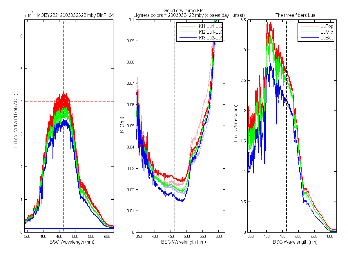
Figure 25C
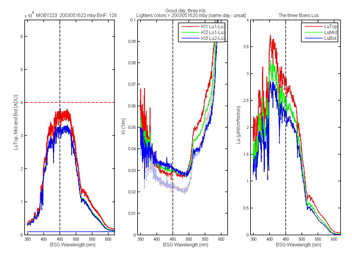
Figure 26C
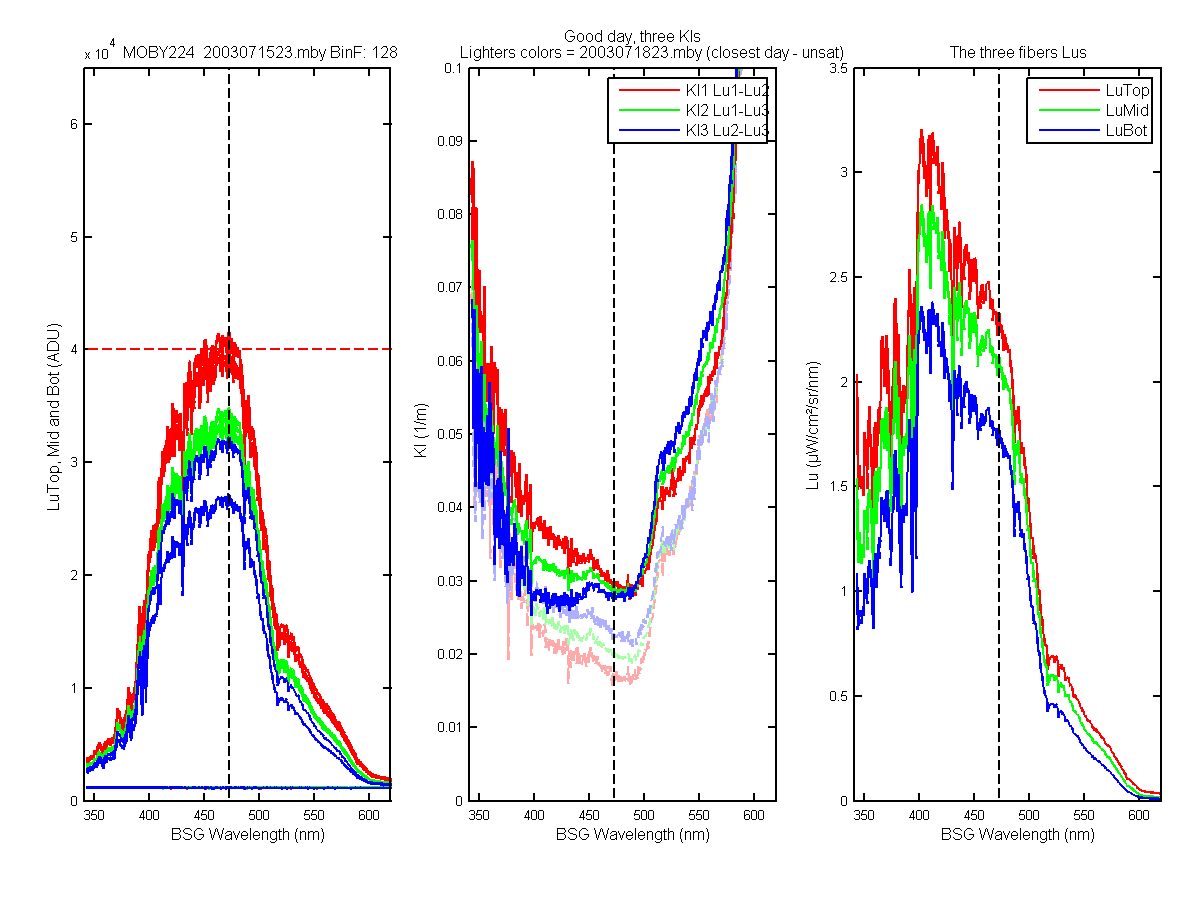
Figure 27C
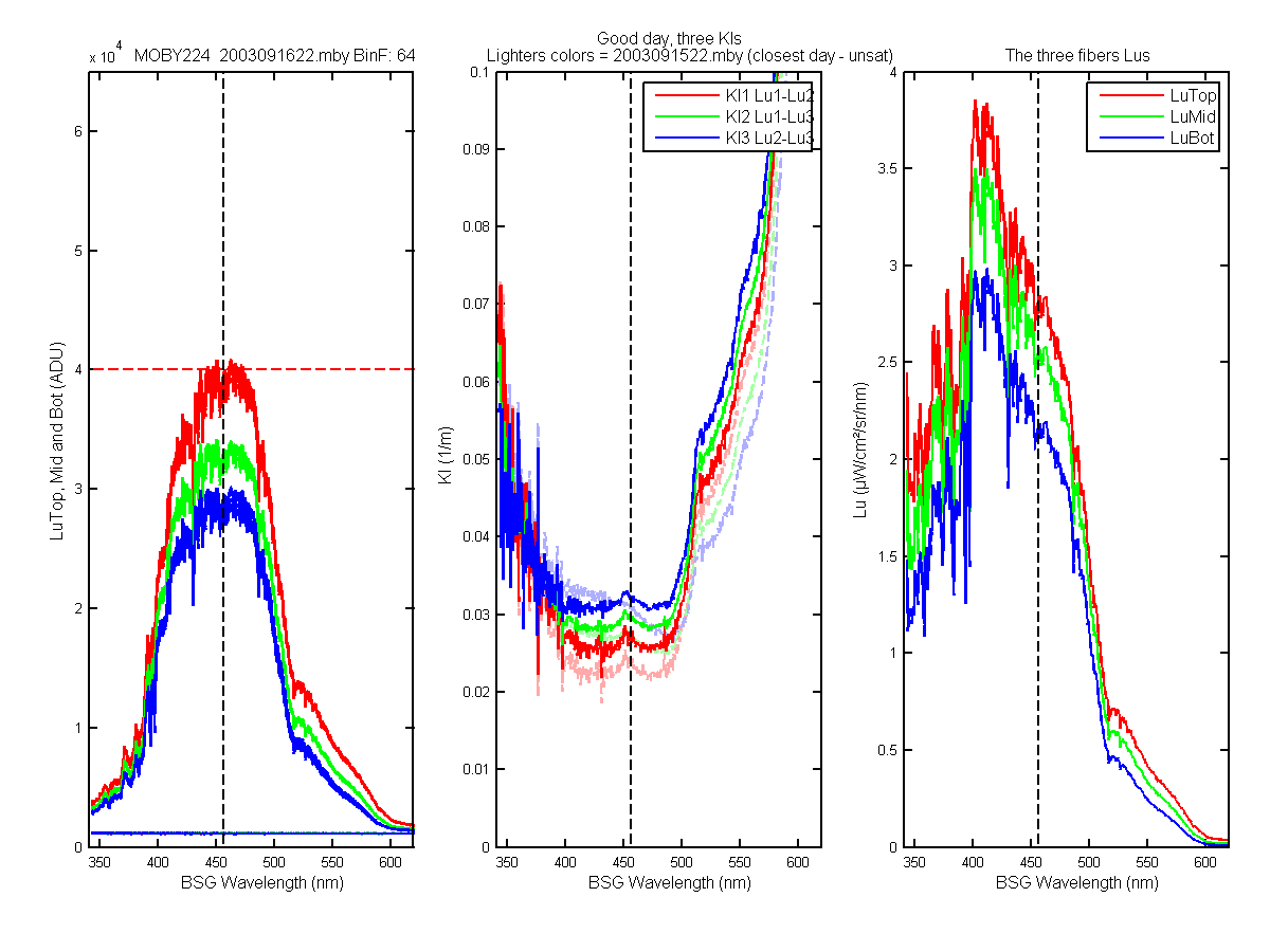
Figure 28C
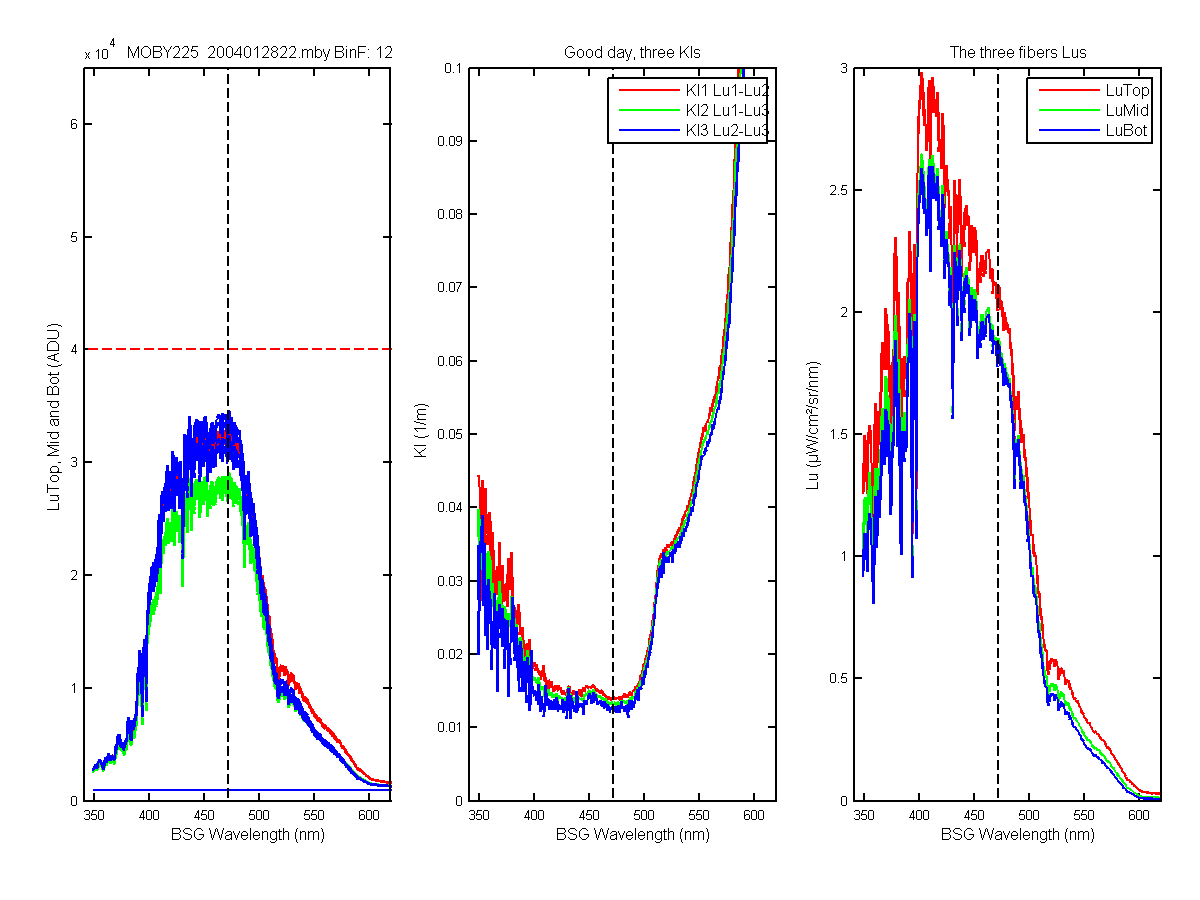
Figure 29C
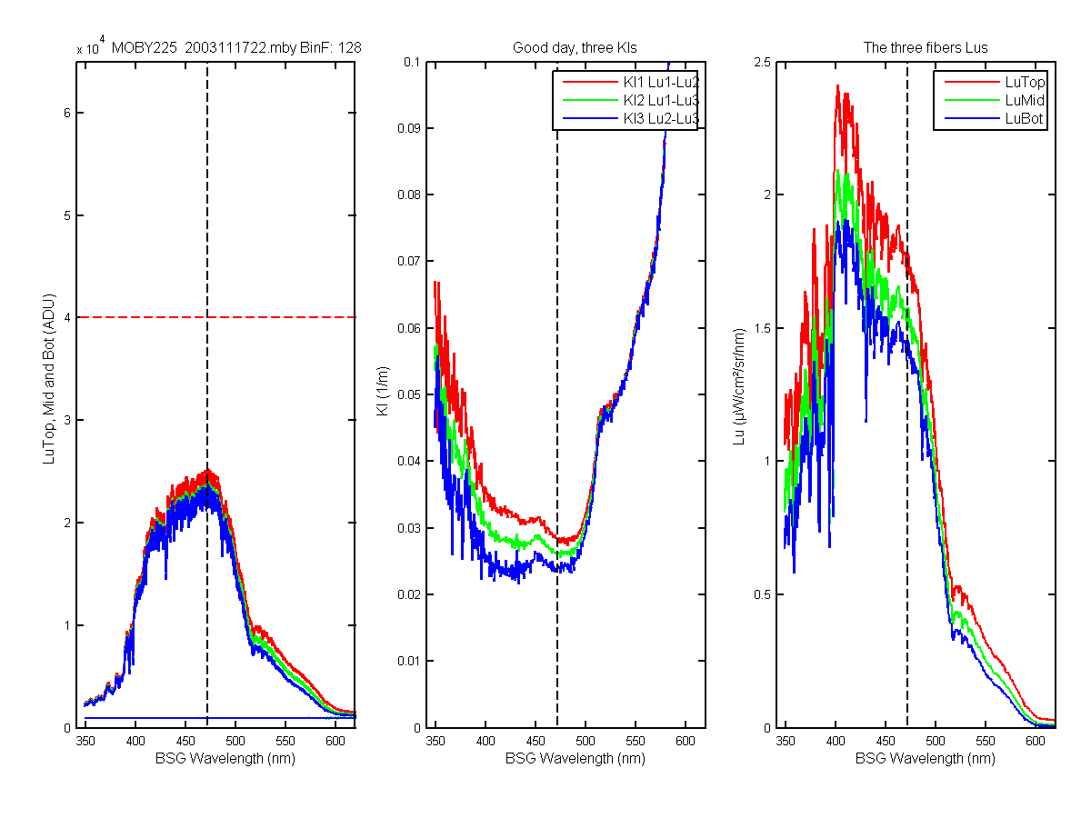
Figure 30C
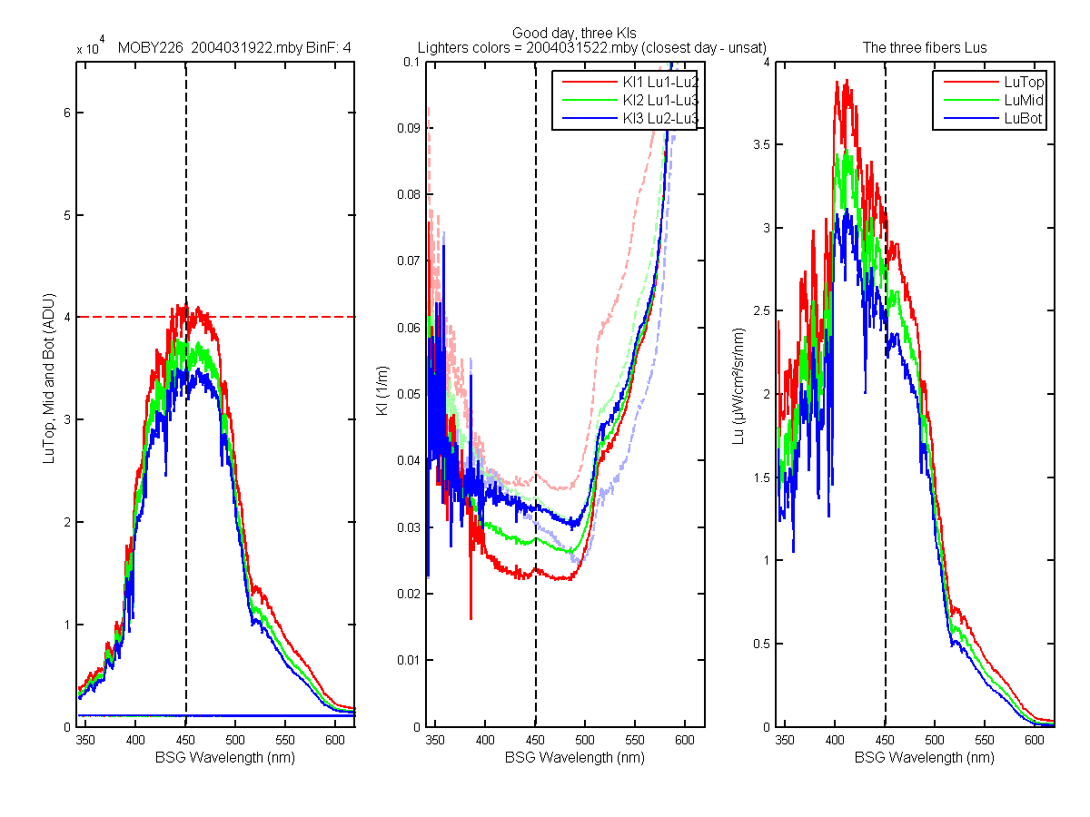
Figure 31C
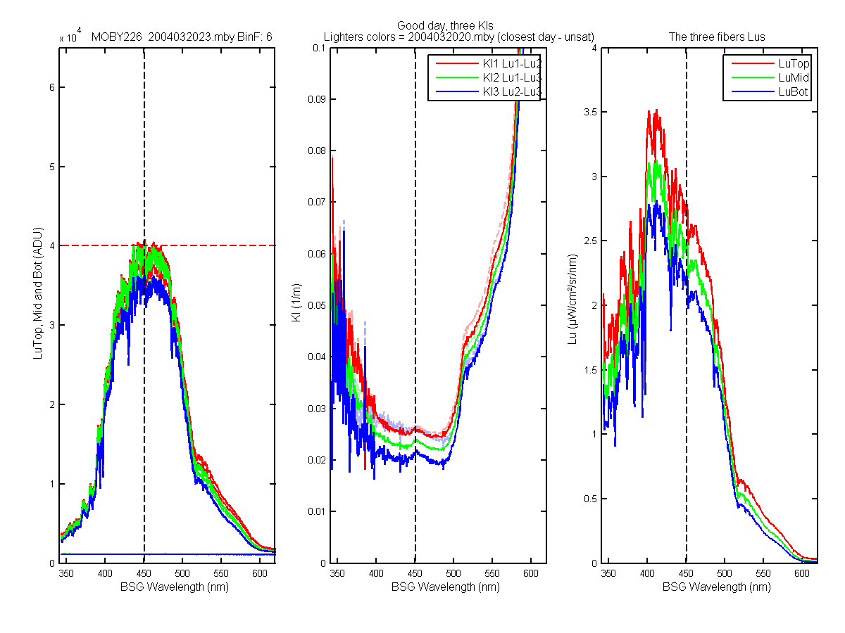
Figure 32C
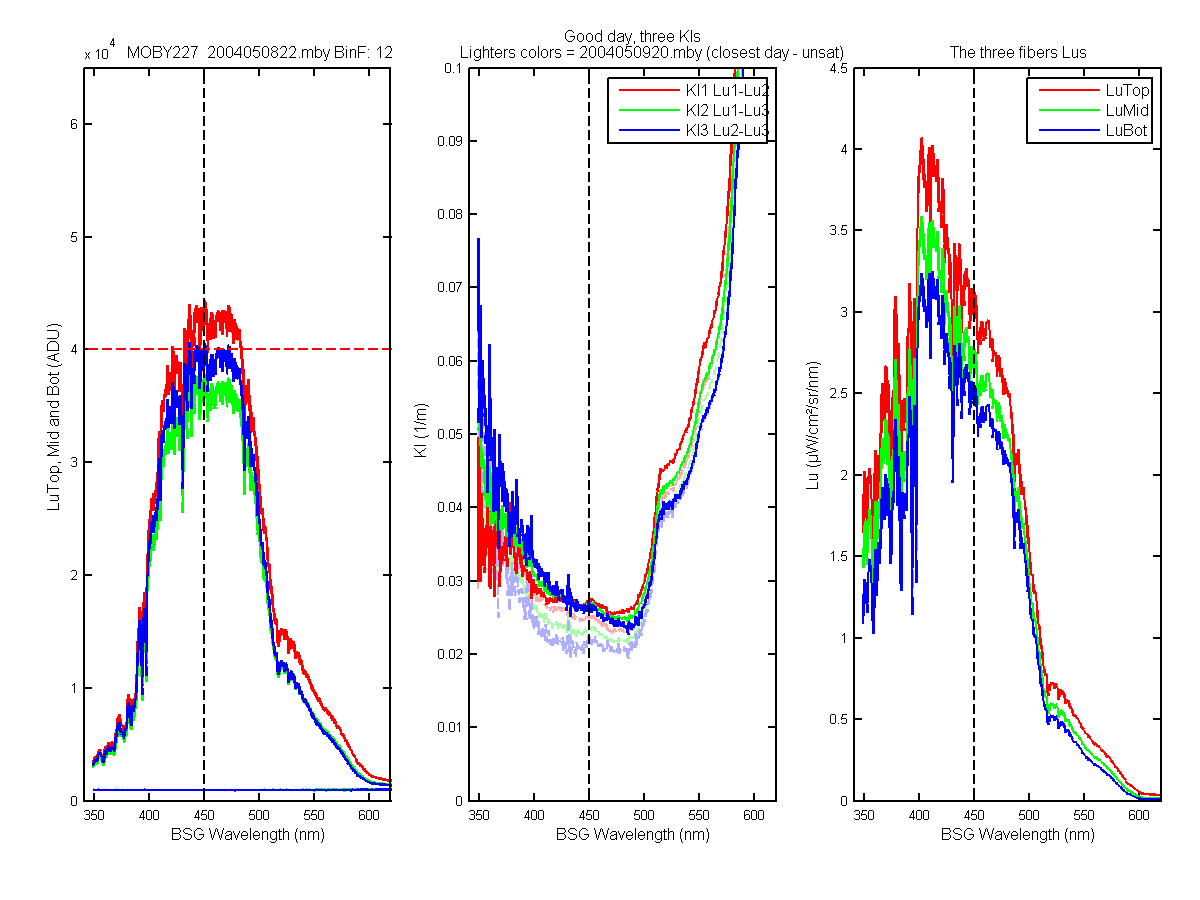
Figure 33C
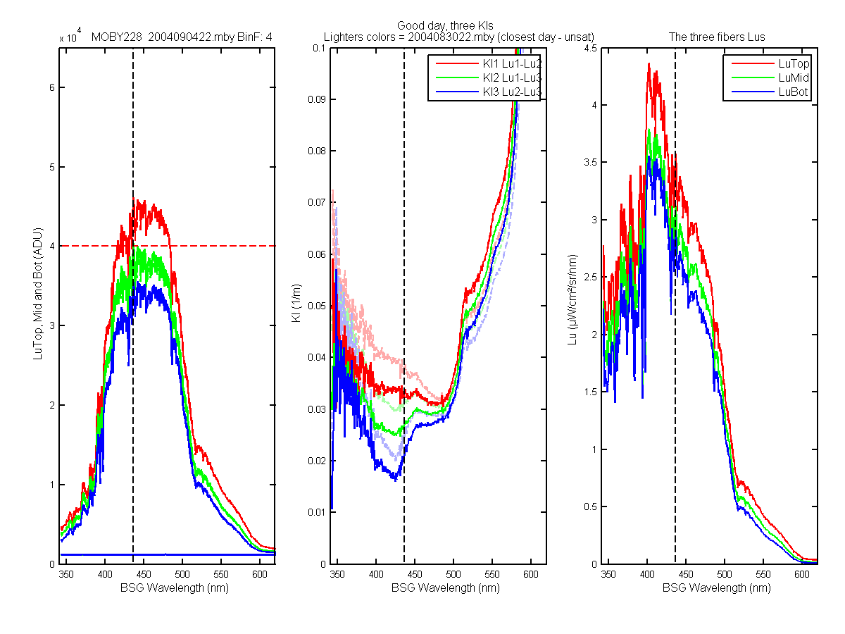
Figure 34C
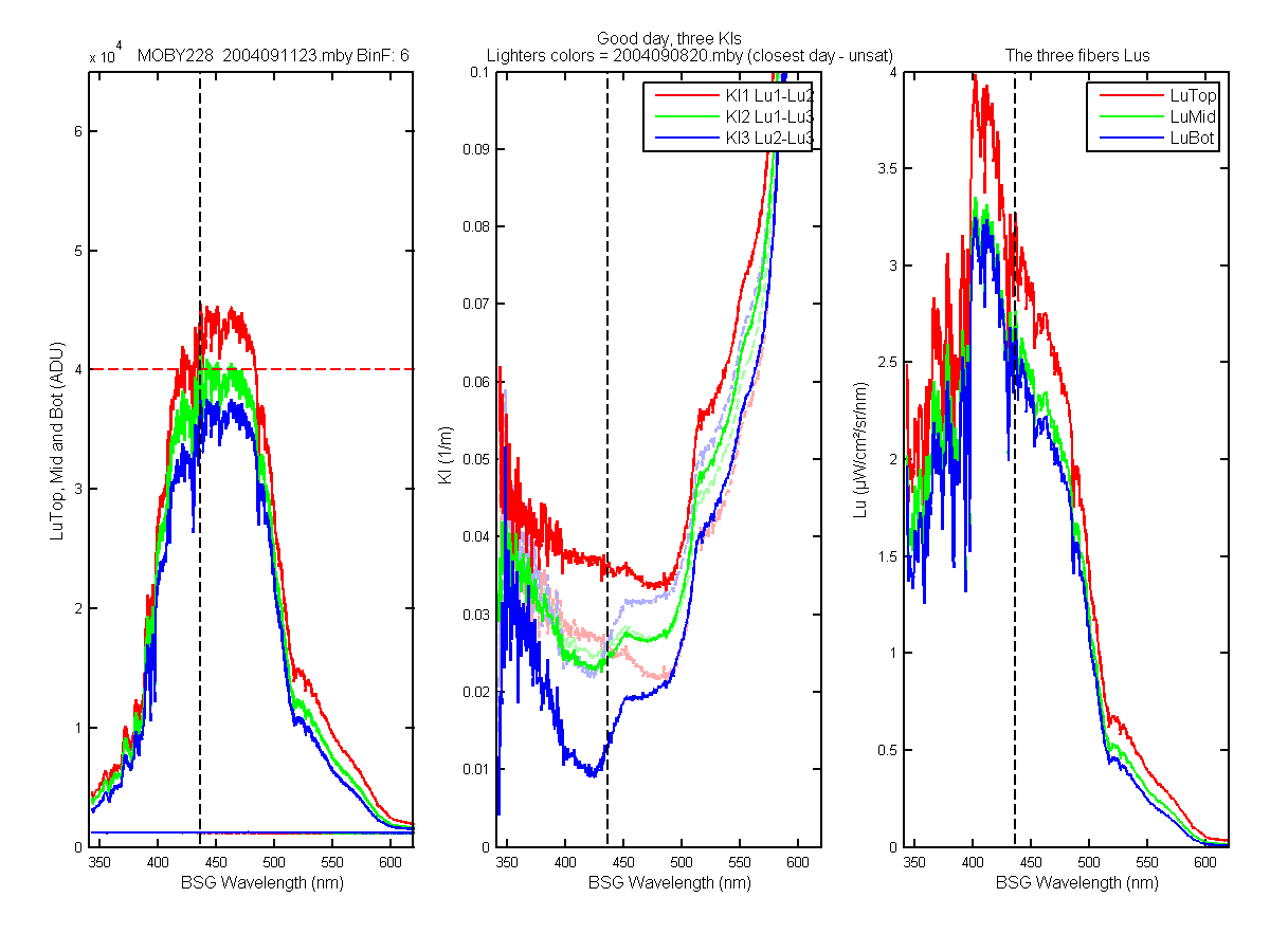
Figure 35C
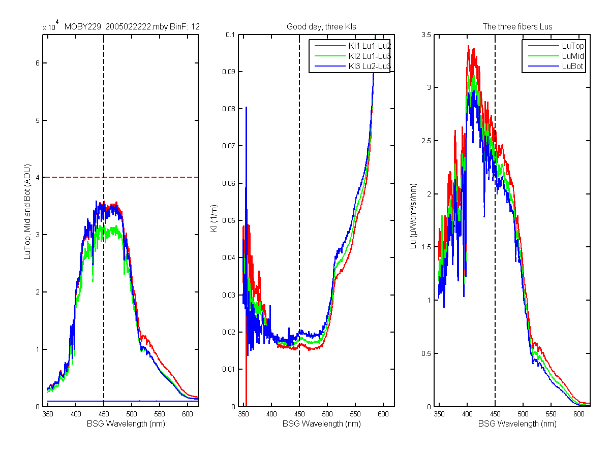
Figure 36C
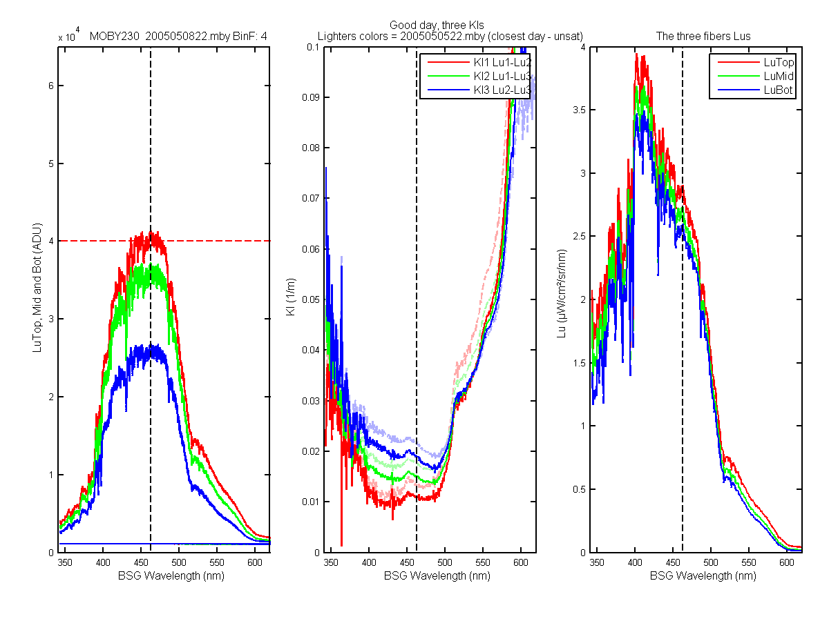
Figure 37C
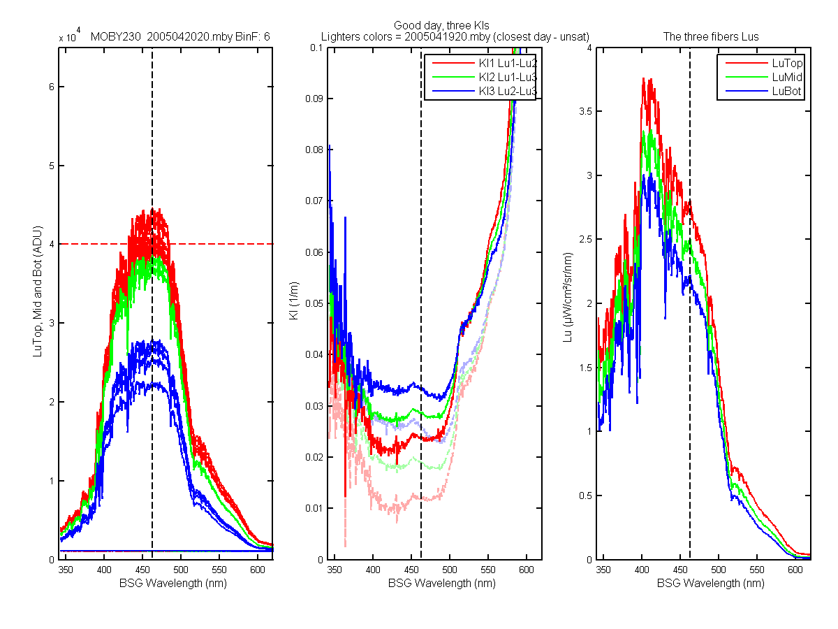
Figure 38C
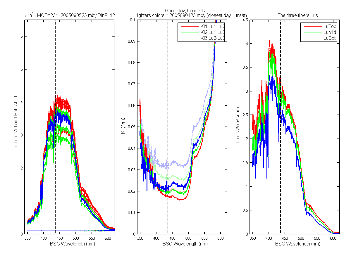
Figure 39C
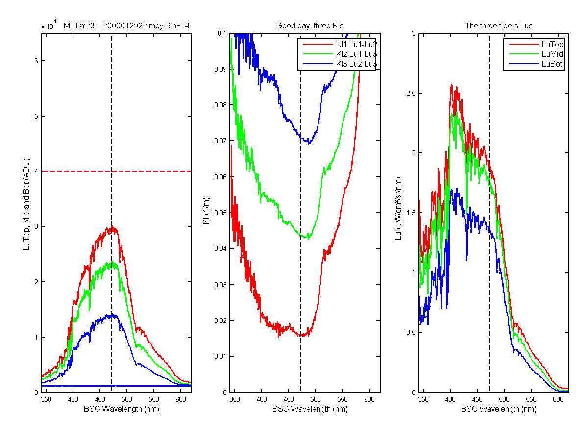
Figure 40C
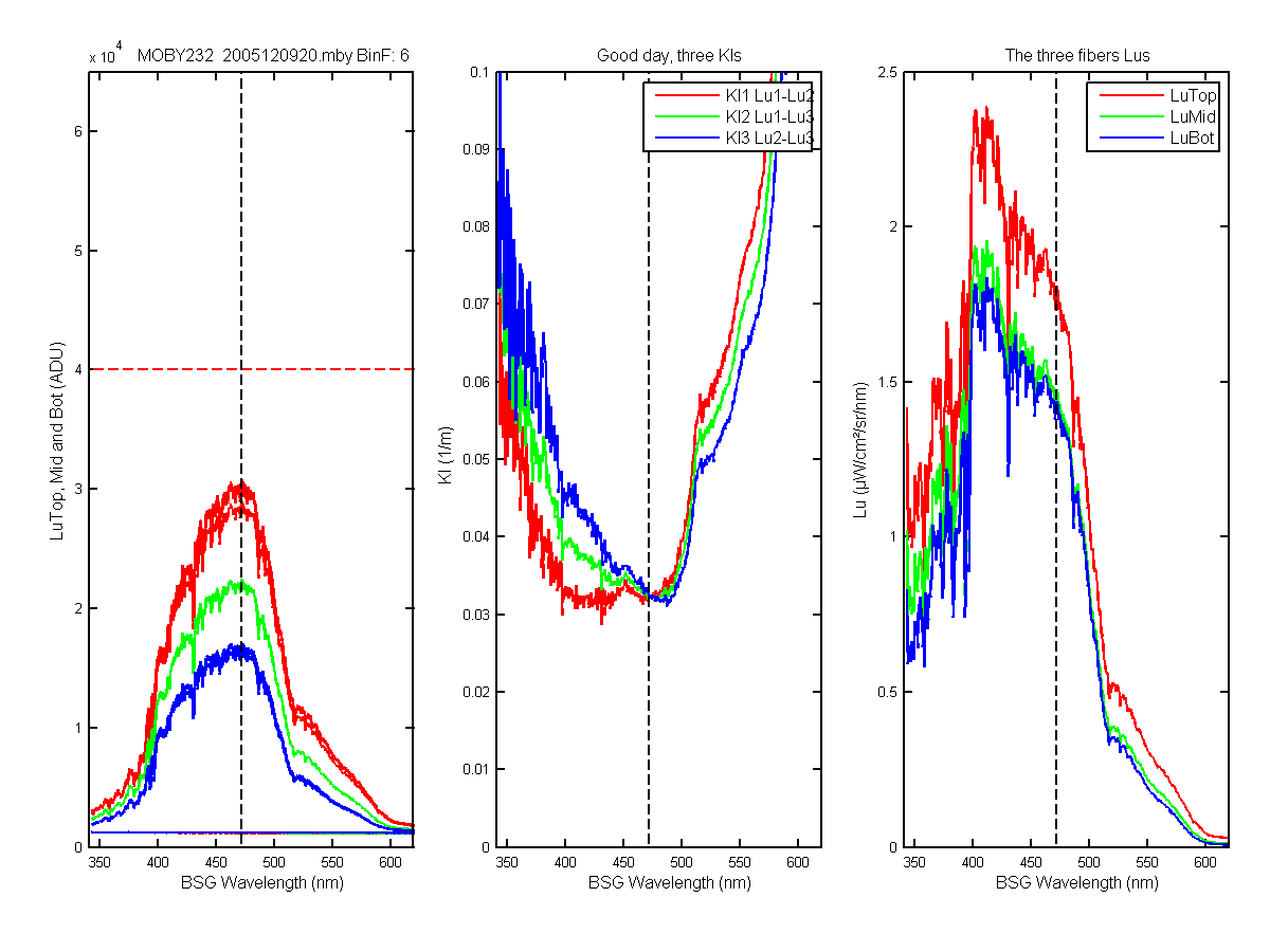
Figure 41C
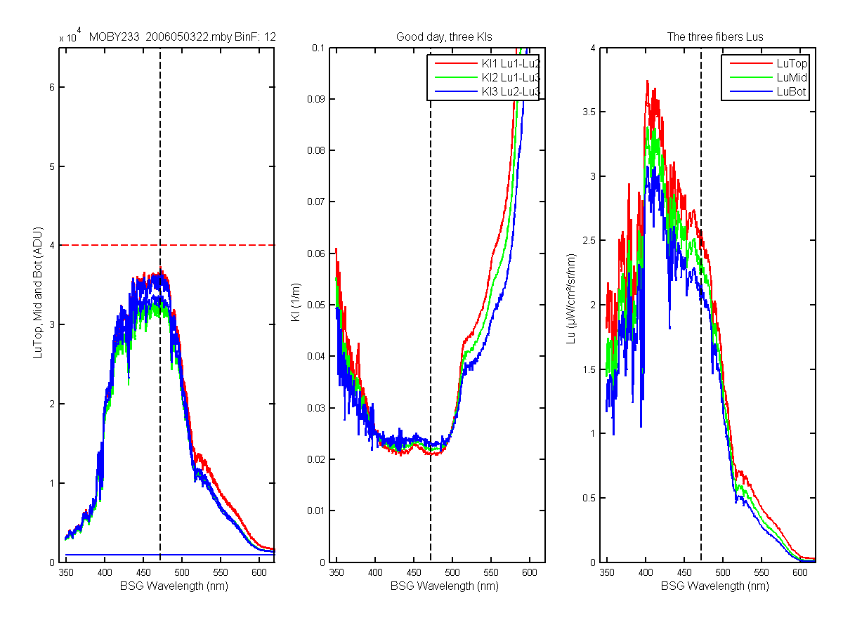
Figure 42C
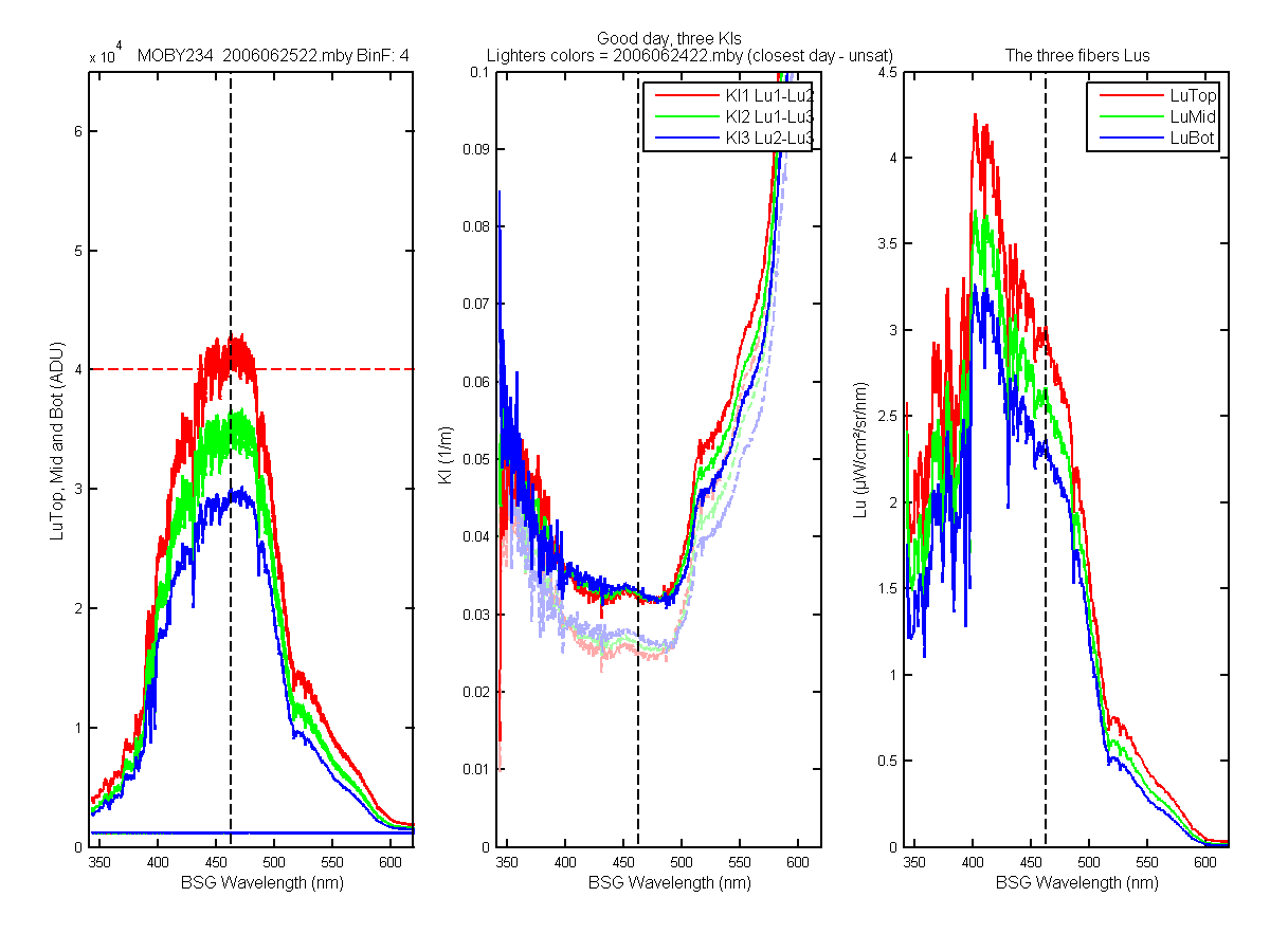
Figure 43C
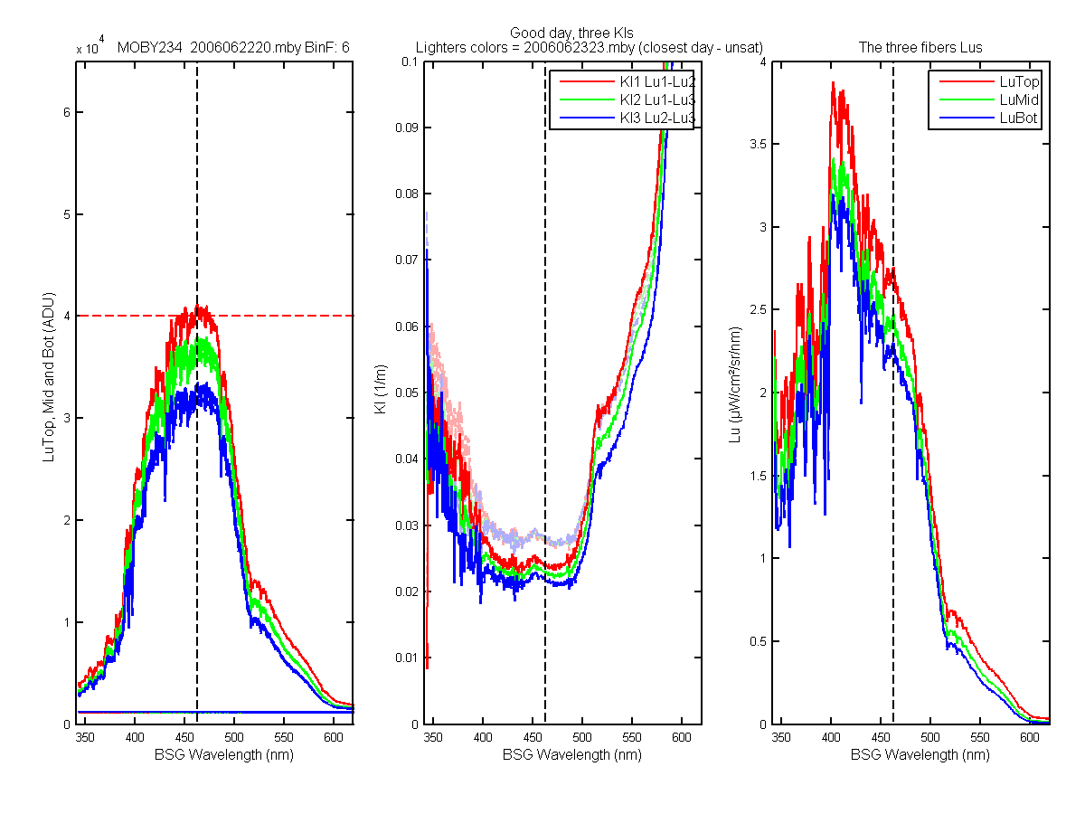
Figure 44C
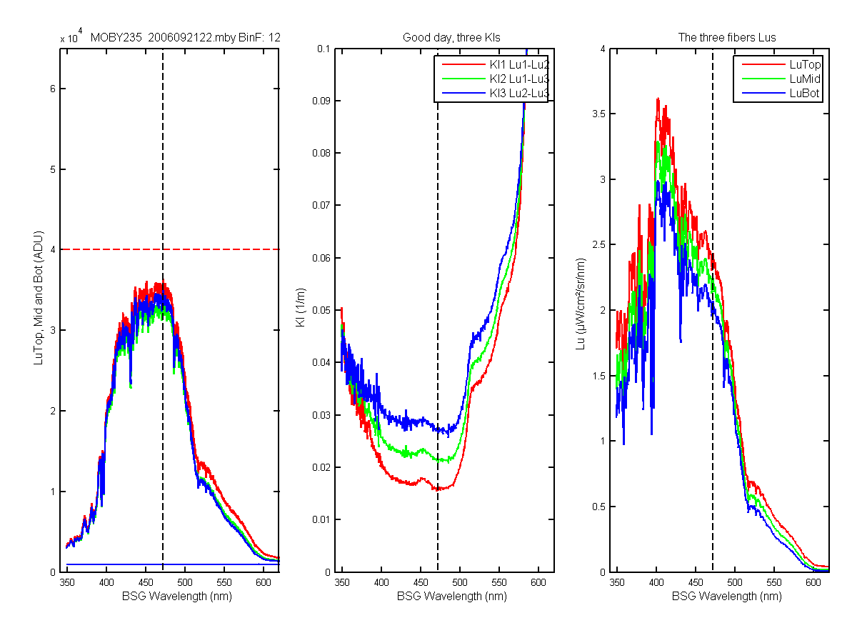
Figure 45C
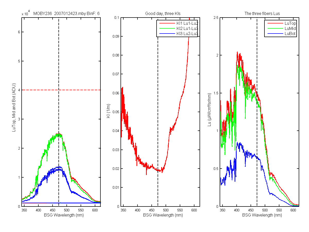
Figure 46C
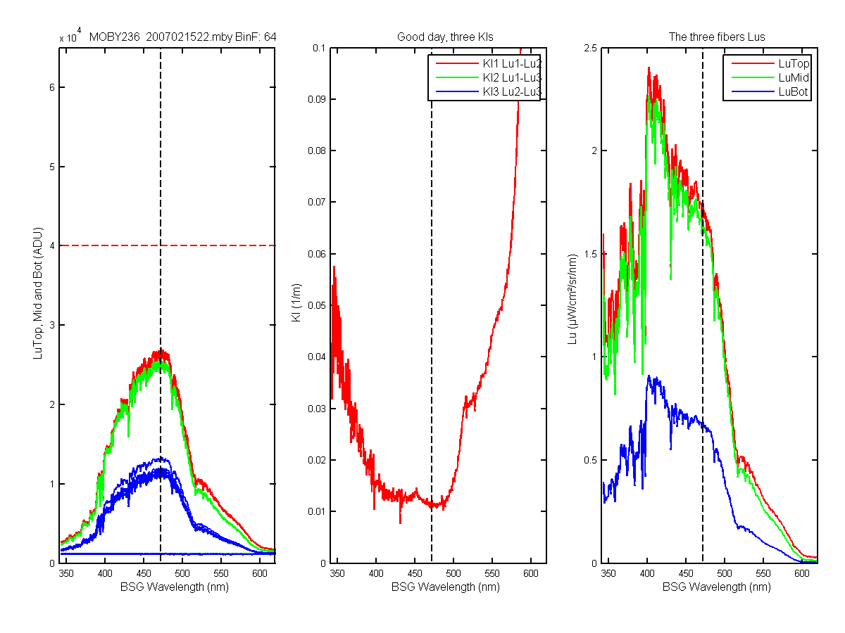
Figure 47C
Figure 48C
Figure 49C
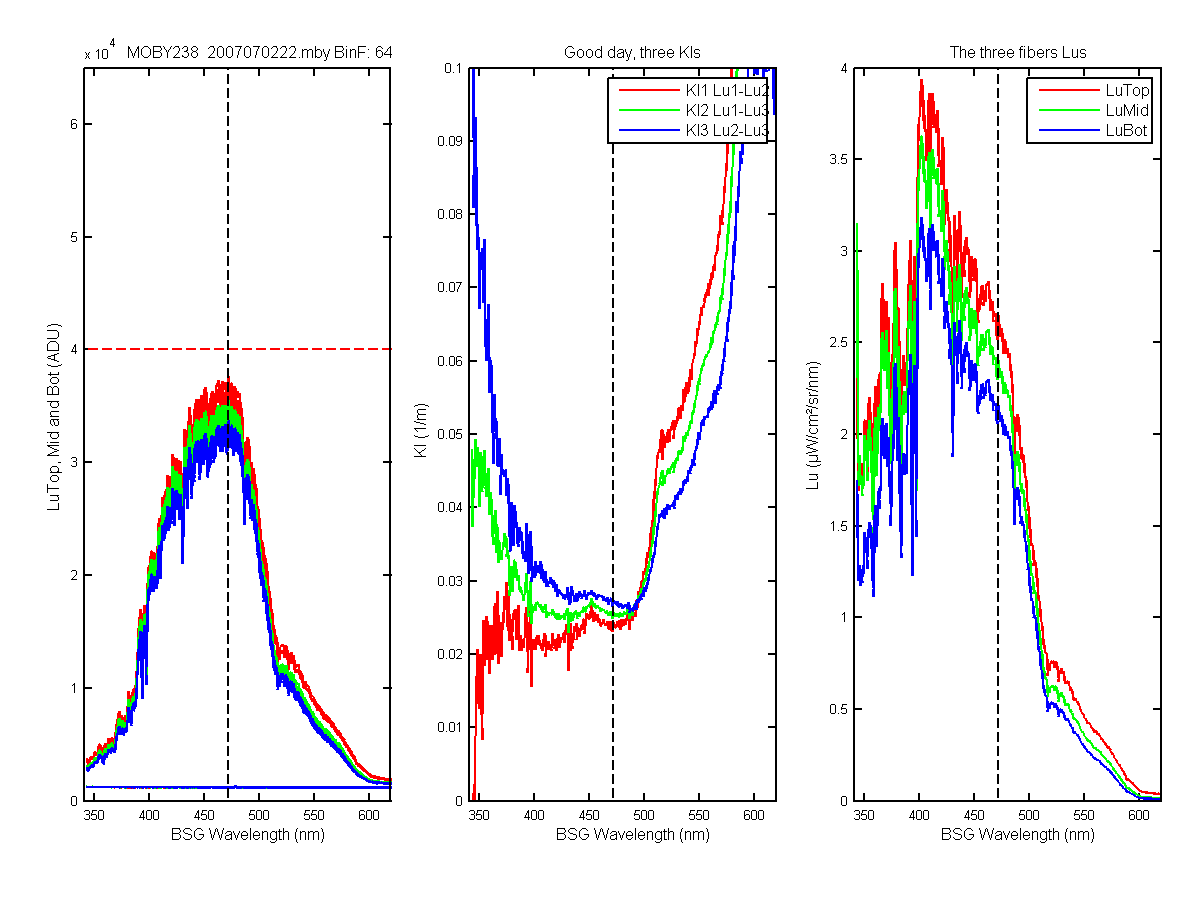
Figure 50C
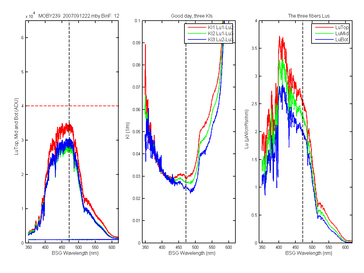
Figure 51C
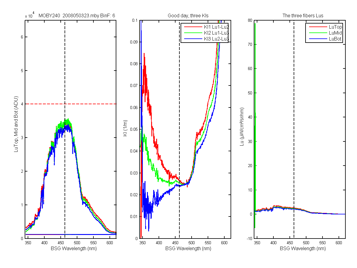
Figure 52C
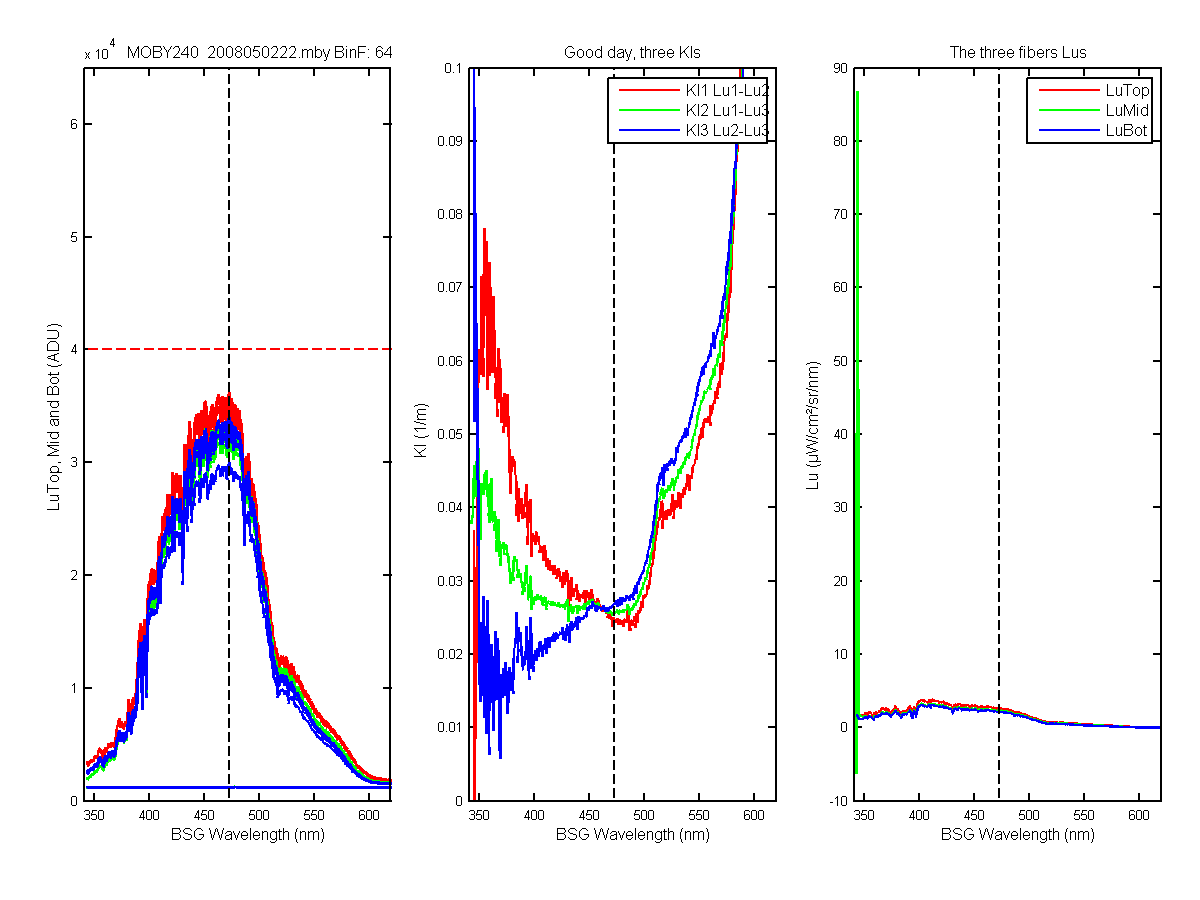
Figure 53C
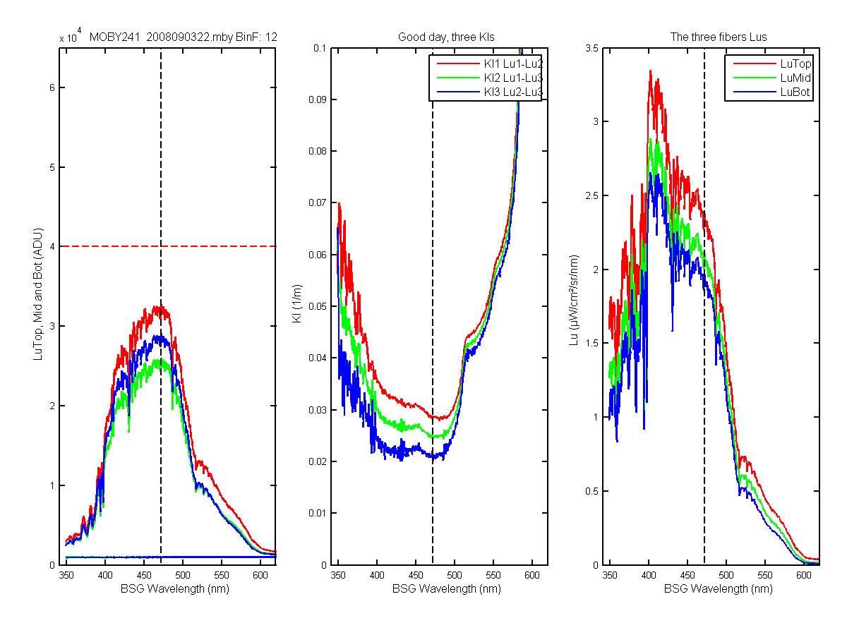
Figure 54C
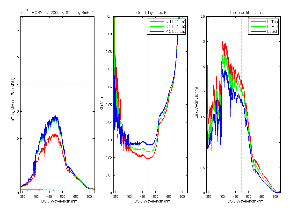
Figure 55C
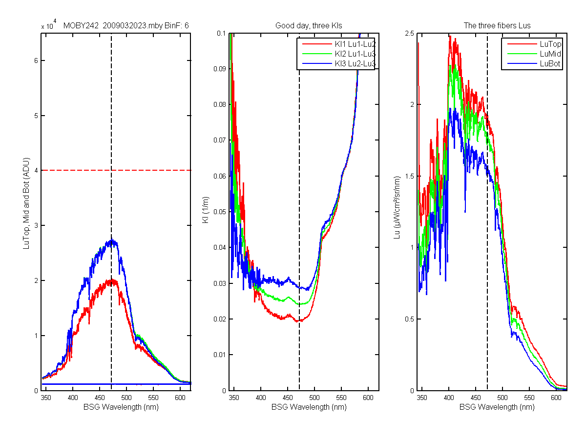
Figure 56C
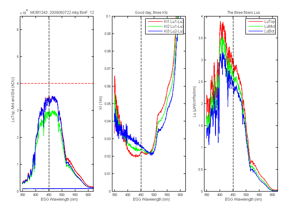
Figure 57C
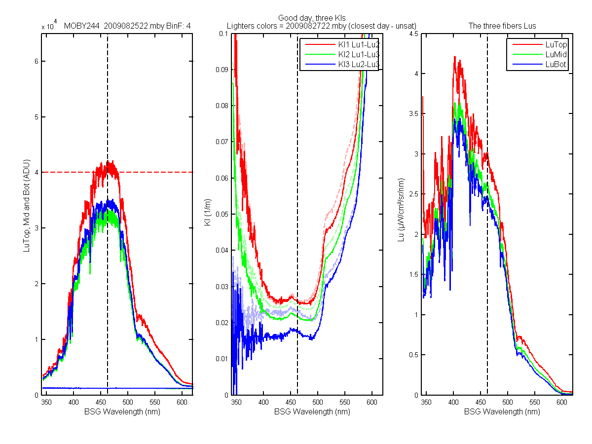
Figure 58C
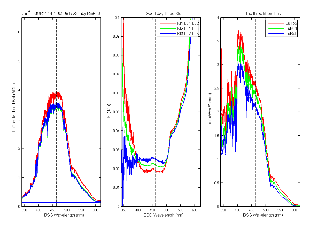
Figure 59C
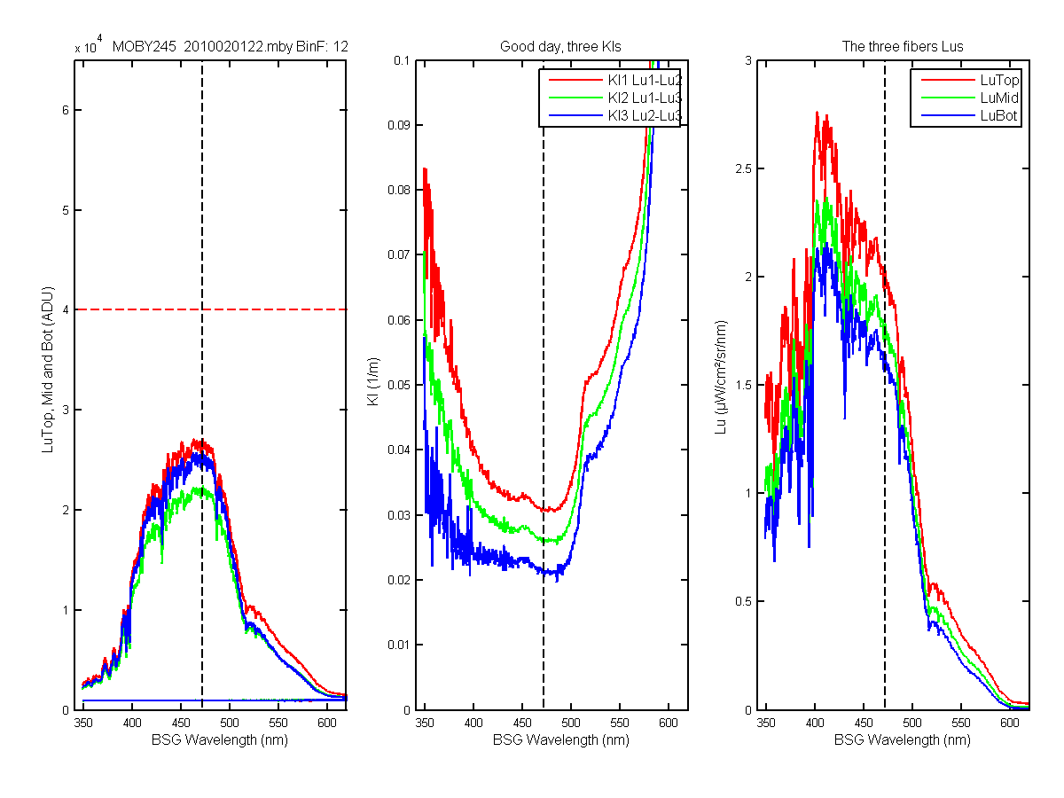
Figure 60C
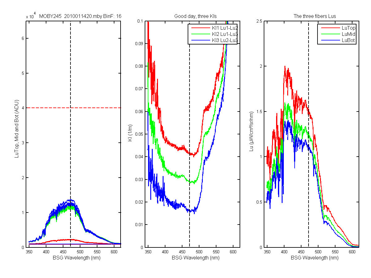
Figure 61C
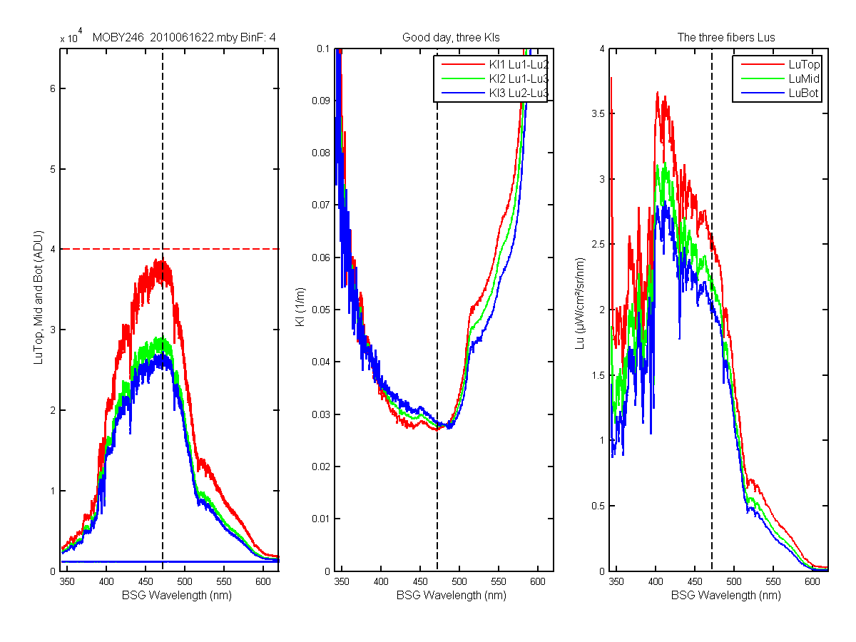
Figure 62C
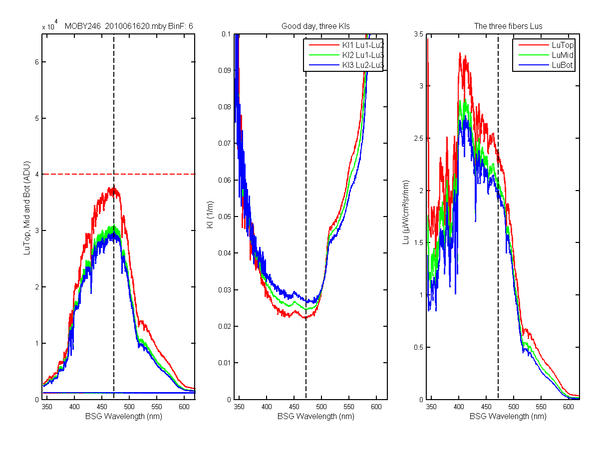
Figure 63C
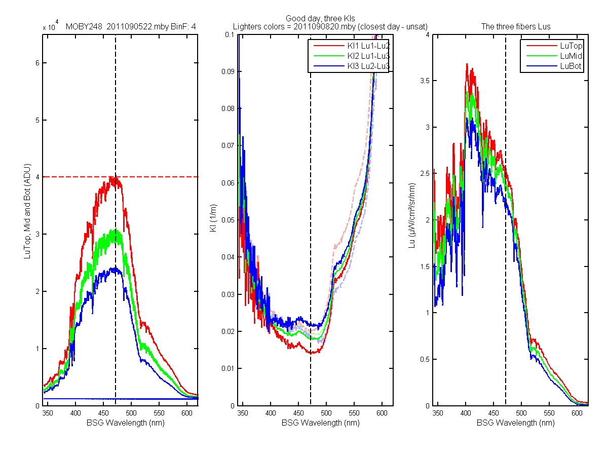
Figure 64C
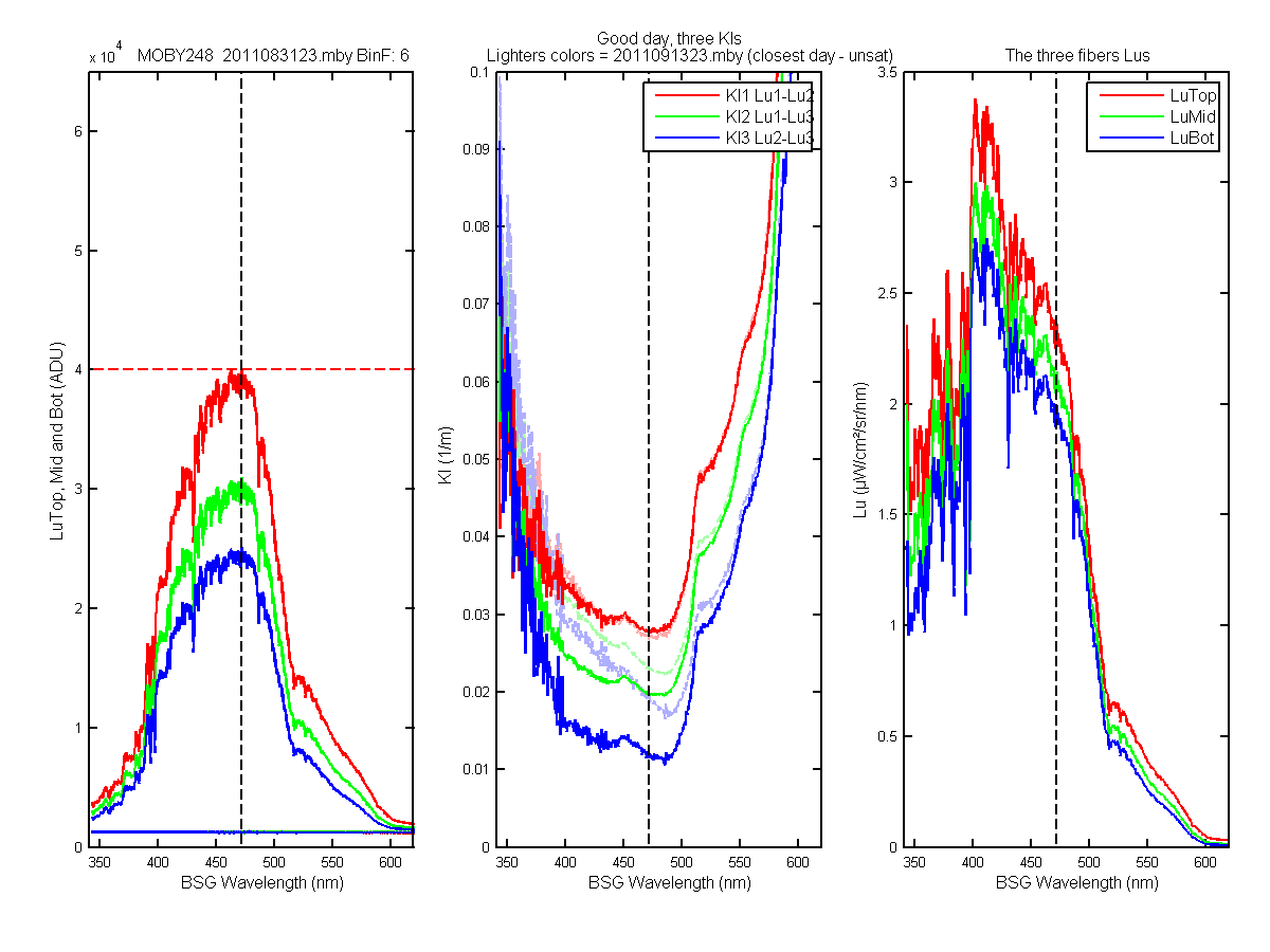
Figure 65C
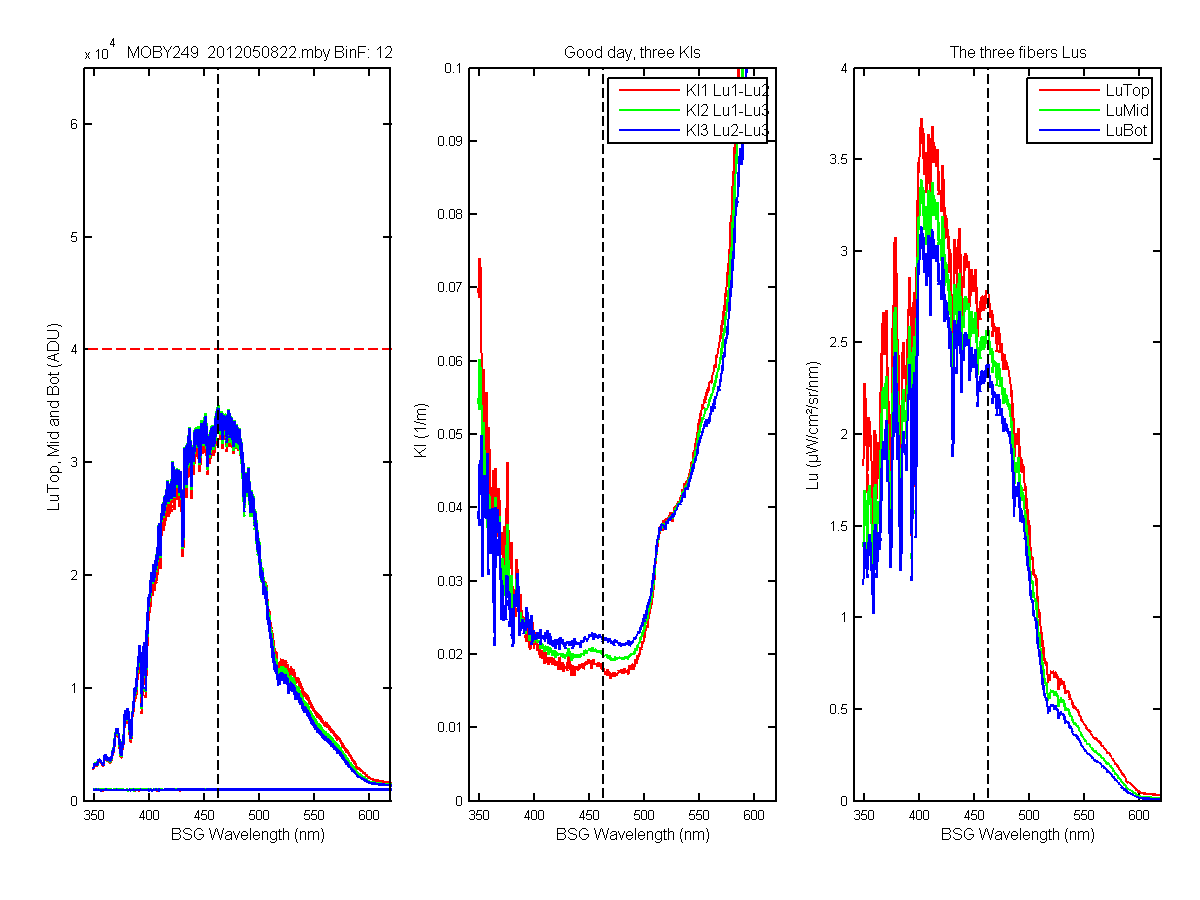
Figure 66C
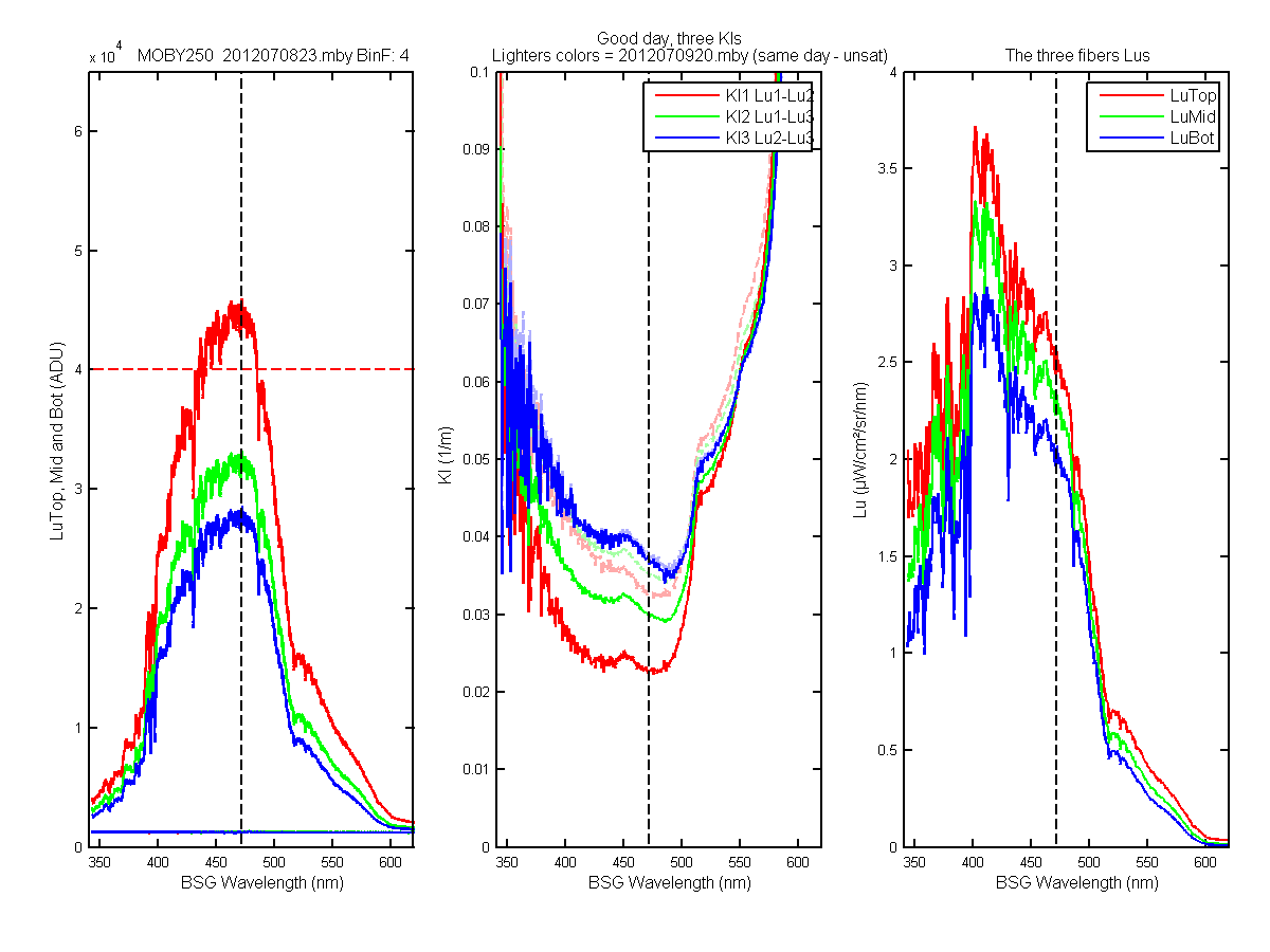
Figure 67C
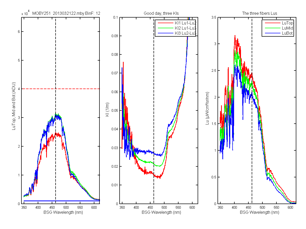
Figure 68C
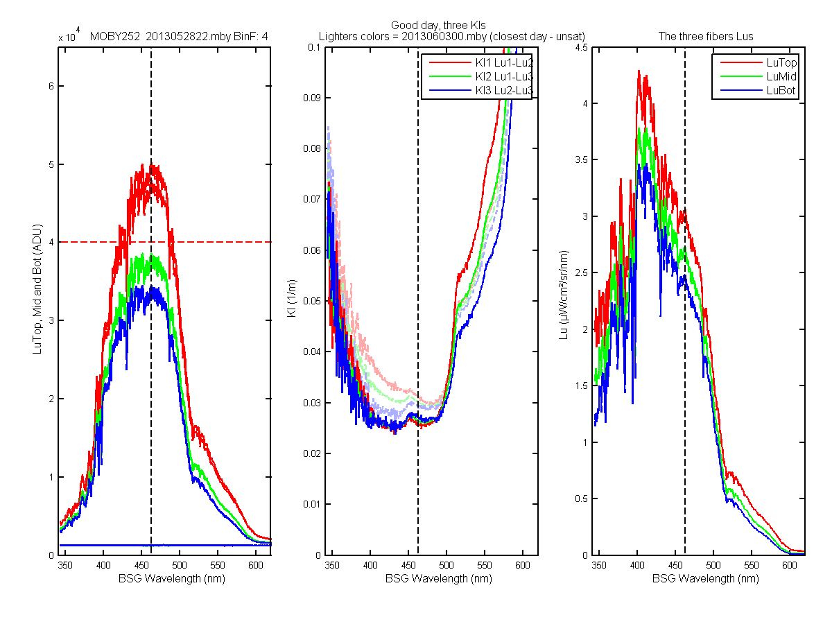
Figure 69C
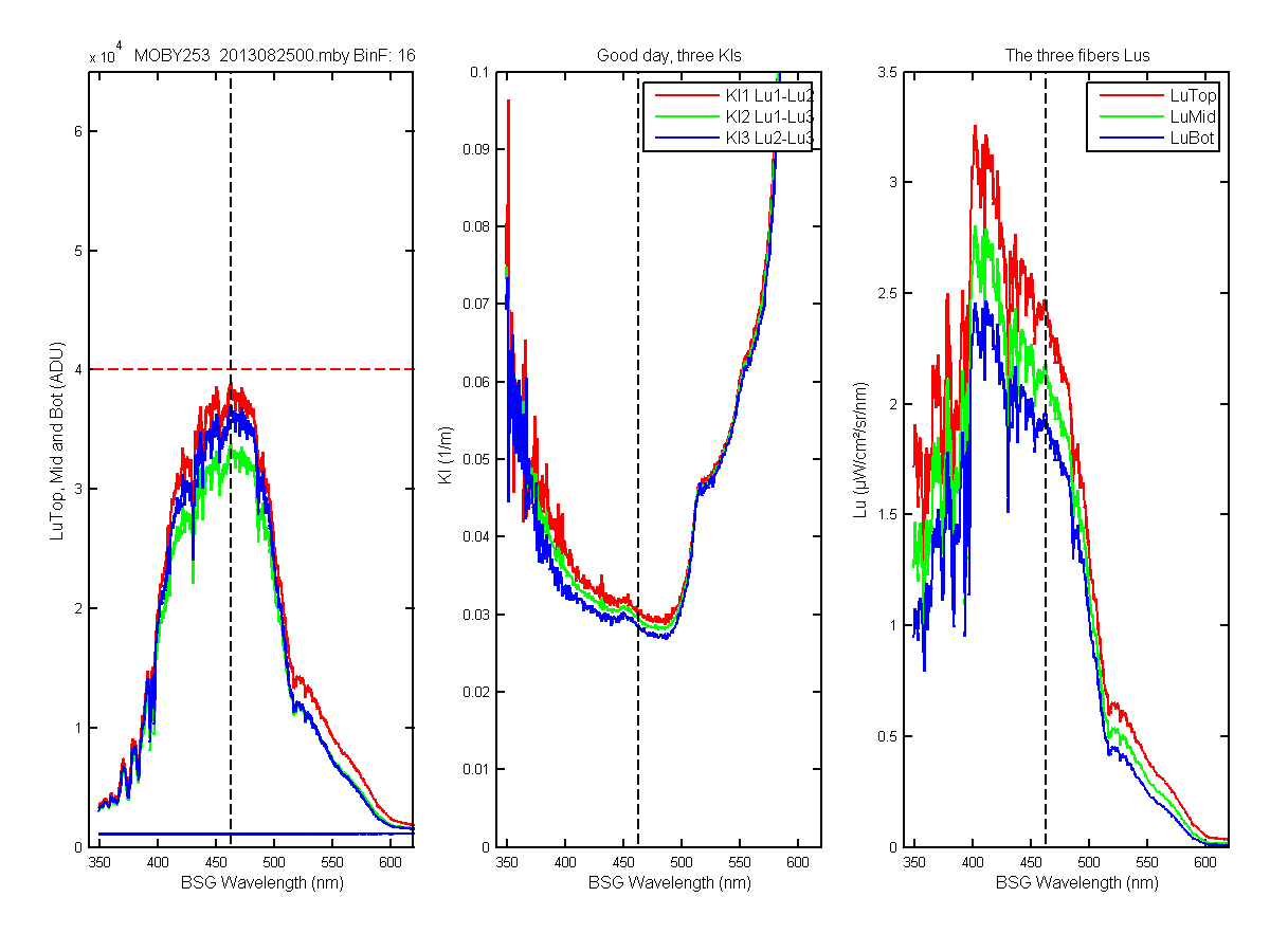
Figure 70C
Extra examples of the M250, 252 and 253 deployments
Figure 1D

Figure 2D

Figure 3D
Kls of all the 22 and 23 hour files which were marked bad because of saturation but where originally good. Most show the "noise" in the Kl1, a few do not. They were likley marked bad because the Es data were saturated too. You would think is the Es data were saturated you would see the same noise in the Kls data. So either the Es data are not saturated and there images look better than the Lus or something else is going on.
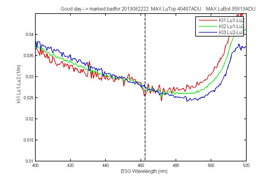
Figure 1E
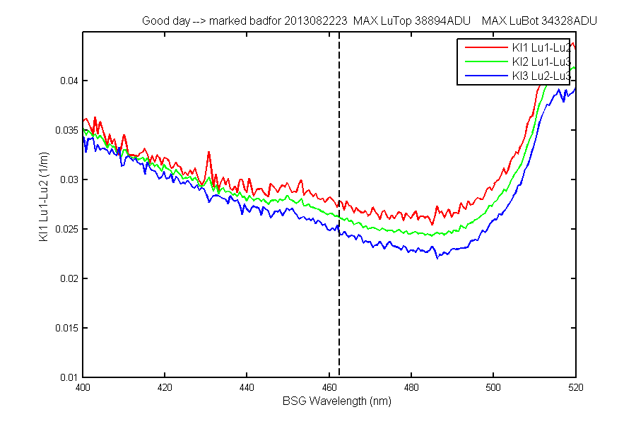
Figure 2E
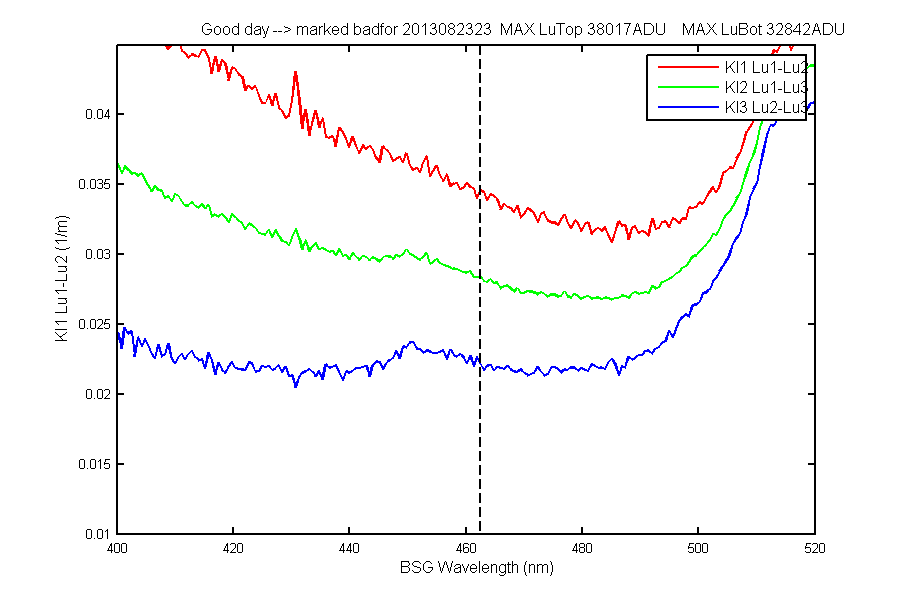
Figure 3E
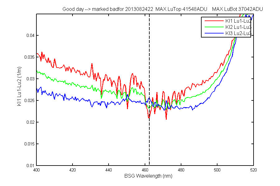
Figure 4E
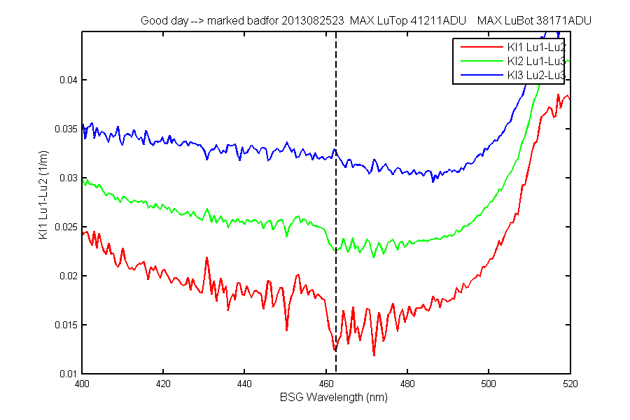
Figure 5E
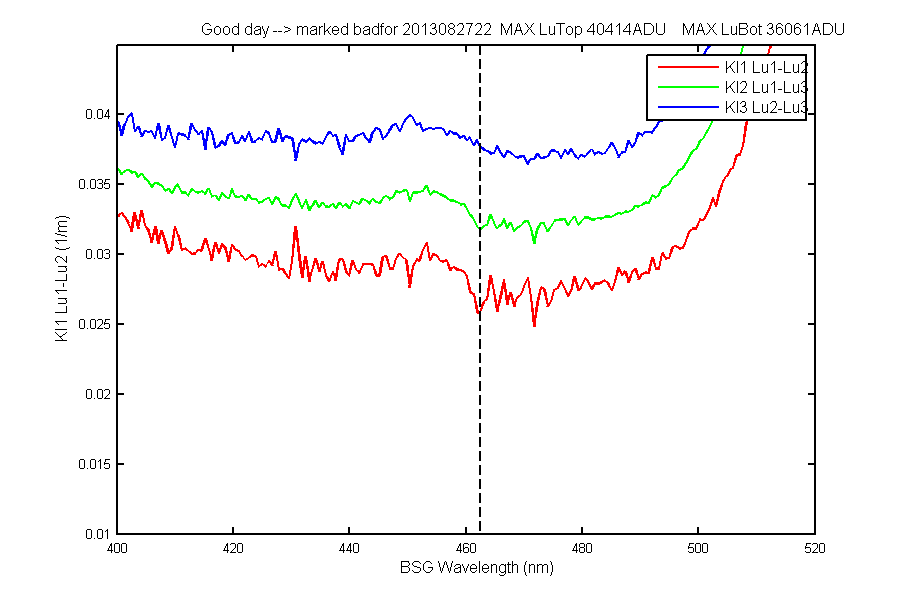
Figure 6E
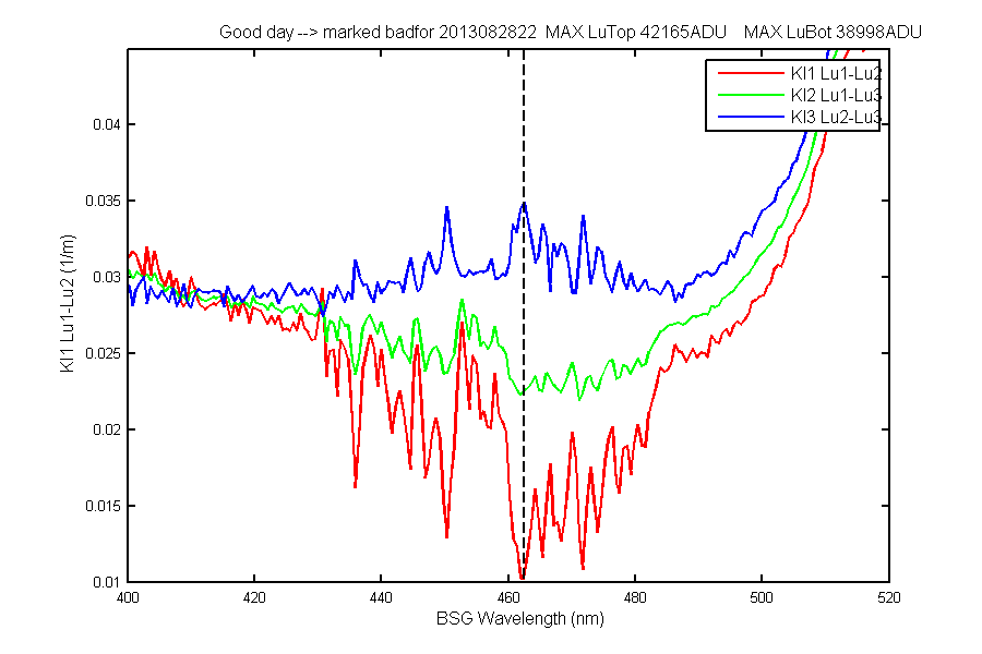
Figure 7E
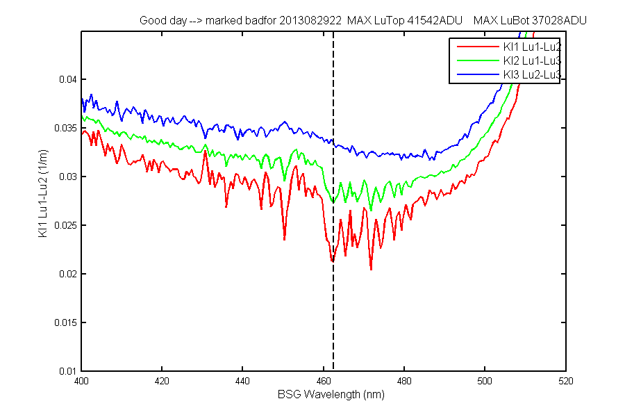
Figure 8E
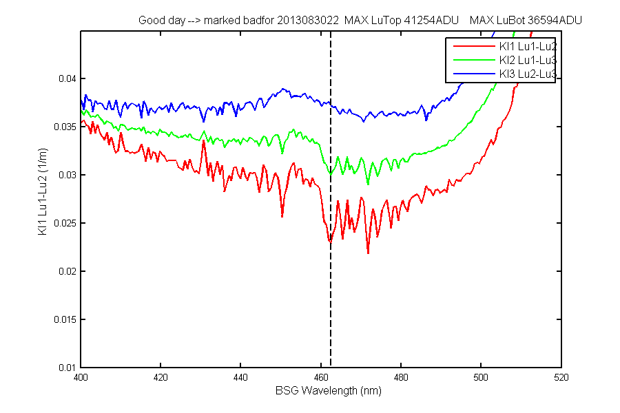
Figure 9E
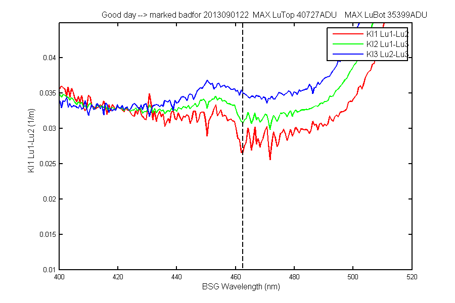
Figure 10E
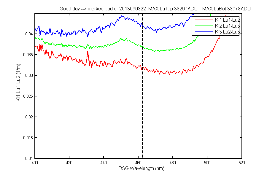
Figure 11E
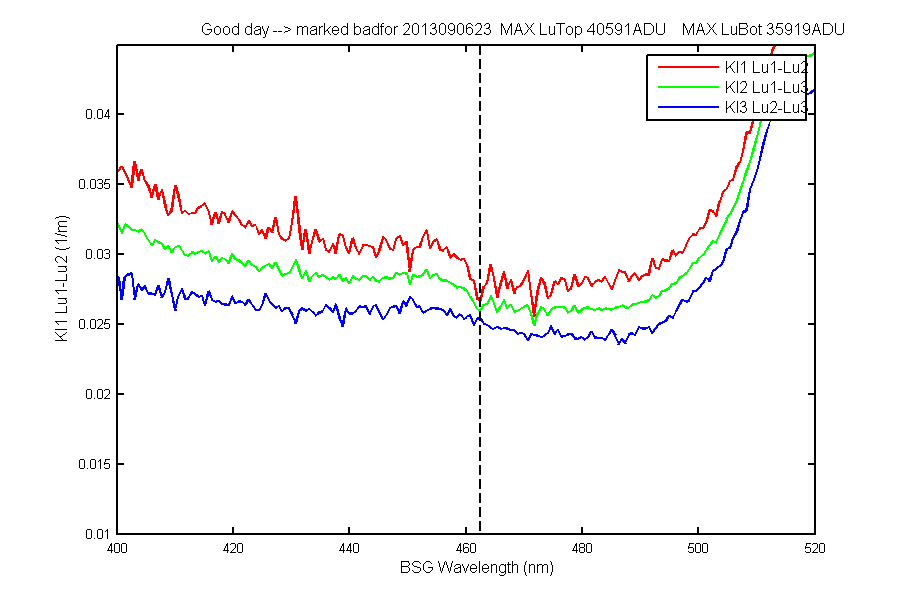
Figure 12E
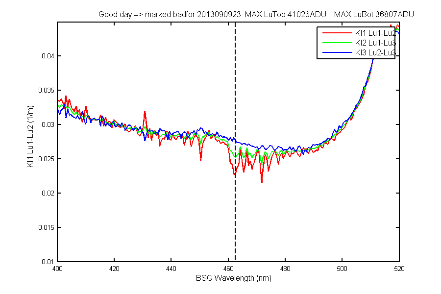
Figure 13E
REV date: 01-Jul-2014 14:50:30